Meet the Author

Artist | Owner of Squishing Paint | Educator - Sara brings over 40 years of creative experience, a decade of specializing in acrylic painting, and a passion for guiding new artists as they embark on their own artistic journeys


Some of the links in this article are affiliate links which means that if you choose to click on them and make a purchase, I earn a small commission at no extra cost to you.
Also, as an Amazon Associate, I earn from qualifying Amazon purchases.
For more details, please read the full disclosure here.
Thanks so much for your support!
Welcome, painting pals! Are you ready to uncover the magic of line in art? Painting is so much more than just slapping on colors. Those lines you draw, whether bold or delicate, have the power to shape your masterpiece in ways you never imagined.
In this article, we’re going to explore the secrets of line in art specifically tailored for beginners like you. We’ll uncover essential techniques that will transform your blank canvases into dynamic works of art that’ll make heads turn and jaws drop.
Key Takeaways:
- Line is Fundamental: Line isn’t just a stroke of the brush; it’s the backbone of art, defining, shaping, and communicating ideas.
- Types of Lines: Different types of lines convey distinct emotions and characteristics in art:
- Horizontal lines evoke tranquility.
- Vertical lines signify strength and authority.
- Diagonal lines add dynamism and tension.
- Curved lines bring grace and movement.
- Zigzag lines inject excitement and vibrancy.
- Irregular lines offer spontaneity and complexity.
- Curvilinear lines contribute to the sense of fluidity and elegance.
- Line Techniques in Acrylic Painting:
- Bold brush strokes create movement and energy.
- Hatching and cross-hatching add depth and emphasis.
- Stippling adds texture and visual interest.
- Controlled brush strokes help in creating smooth, precise lines.
- Application of Line in Art: Line isn’t just about outlining; it’s about adding depth, texture, and visual interest to acrylic paintings. Techniques include controlled brush strokes, line variations, embracing negative space, and layering for depth.
- Step-by-Step Tutorial Highlights:
- Using different line techniques to paint a sunset sky, meadow, mountains, tree line, and river.
- Each step illustrates how specific lines and techniques contribute to the overall composition, adding depth, texture, and realism.
- Beginner-Friendly Exercises: Practice exercises to master different types of lines and line techniques, laying the foundation for expressive and dynamic artwork.
- Exploring Art Styles and Line: Studying various art styles like Impressionism, Cubism, Surrealism, Abstract Expressionism, and Pop Art provides inspiration and insights into the diverse use of lines in art.
- Troubleshooting Tips: Address common problems or mistakes encountered while working with lines, offering solutions and guidance to improve line quality and control.

Understanding The Role Of Line In Art
Line in art is the secret ingredient that transforms your artwork from ordinary to extraordinary. Each stroke narrates a story, whether bold or subtle, adding its own character. Horizontal lines bring calm, vertical lines exude strength, and diagonal lines inject drama. Beyond borders, line encompasses texture, patterns, and mood. Smooth lines glide elegantly, while jagged lines evoke emotion. It’s a formidable force in art, addressing principles like emphasis, movement, and unity, akin to a Swiss Army knife for crafting visually captivating compositions.
Types Of Lines In Art
When it comes to crafting awesome paintings, mastering the art of lines is a must. Lines aren’t just squiggles on your canvas – they’re like the secret sauce that adds flavor to your masterpiece! Let’s take a closer look at the different types of lines used in art and what they can do for your paintings.
- Straight lines: These bad boys are all about stability and precision. Think of them as the backbone of your painting, keeping everything in order and balanced.
- Curves: Curved lines bring grace and movement to your artwork. They’re like the elegant swirls that make your painting come alive with energy and flow.
- Diagonal lines: These lines are all about dynamism and tension. They’re like the daring adventurers in your painting, leading the eye on an exciting journey through your composition.
- Zigzag lines: These lines are the life of the party, adding excitement and vibrancy to your painting. They’re like the unexpected twists and turns that keep things interesting.
- Vertical lines: These lines exude strength and authority, adding a sense of grandeur to your artwork. They’re like the tall, confident pillars that hold up your masterpiece.
- Horizontal lines: They bring a sense of calm and tranquility to your painting. They’re like the peaceful horizon that invites you to relax and unwind.
- Curvilinear lines: These lines are all about grace and organic beauty. They’re like the gentle waves that wash over your painting, adding a touch of elegance.
- Irregular lines: These lines are full of surprises, adding spontaneity and complexity to your artwork. They’re like the wild card that keeps your audience guessing.
Mastering Line In Art Techniques For Acrylic Painting
Stippling, bold brush strokes, hatching, and cross-hatching techniques add depth, texture, and visual interest to your paintings. They aren’t just fantastic for creating stunning landscapes or lifelike portraits. They’re also your secret weapon for diving headfirst into the thrilling realm of abstract art.
| Technique | Description |
| Bold Brush Strokes | Create movement and energy with assertive strokes using different brush sizes and pressures. |
| Hatching and Cross-Hatching | Add dimension, depth, and emphasis on form and texture by using parallel lines in various directions. Used to sometimes represent shadows. |
| Stippling | Add texture to your paintings by using dots of varying sizes, densities, and spacing. Great technique for creating foliage. |
Applying Line In Art To Acrylic Painting
If you’re ready to take your artwork to the next level, buckle up because I’ve got a few fantastic tips for you on applying line in art to your acrylic paintings. We’ve already established that line art isn’t just about drawing outlines; it’s a game-changer that can add depth, texture, and visual interest to your creations. Now, let’s talk about how you can use it in acrylic paintings.
- Use Controlled Brush Strokes: Practice using controlled brush strokes to create smooth, precise lines in your acrylic painting. Hold your brush firmly but not too tightly, and experiment with different brush sizes to find the one that best suits your needs. Start with short, light strokes, gradually building up to thicker lines as needed.
- Experiment with Line Variations: Explore different line variations such as thick, thin, broken, or dotted lines to add visual interest and texture to your acrylic paintings. Varying the pressure applied to your brush or adjusting the consistency of your paint can help you achieve these variations effectively.
- Embrace Negative Space: Utilize negative space by painting around objects to define their shapes (Negative space is the empty or unoccupied space that exists between and around the elements of the painting. Artists often use negative space intentionally to define shapes, create balance, and emphasize the main subject).
- Layer for Depth and Dimension: Take advantage of acrylic paint’s fast-drying properties by layering different colors and lines to create depth and dimension in your artwork. Start with a base layer of lines and gradually build up additional layers.
Line In Art Step-by-Step Tutorial
Now that you’ve got a good idea what the big deal is about line art and a few tips to help you out, let’s put it into action.
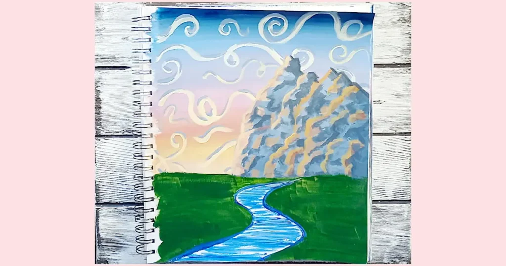
Let’s create a simple composition of a landscape scene with a sunset sky filled with swirling clouds, a mountain range, a calm meadow with a few trees, and a curving river.
Materials Needed:
- Painting surface of your choice
- Acrylic paints (various colors):
- Paintbrushes (various sizes):
- Flat Brush
- Round Brush
- (Deer Foot) Stippling Brush (or old paint brush with splayed bristles)
- Small detail round/script/liner brush (for making thin lines)
- Palette
- Water cup for cleaning brushes
- Paper towels for drying brushes
I want to preface this by saying, this tutorial isn’t about striving for perfection. It’s not about creating a masterpiece (though if you end up with one, that’s fantastic!). It’s all about exploring the use of line in art, seeing how different types can elevate your painting, understanding how they interact to craft captivating compositions, and most importantly, having a blast while you learn. I mean, my painting sure isn’t perfect but I had so much fun with it.
Step 1: Paint The Sunset Sky
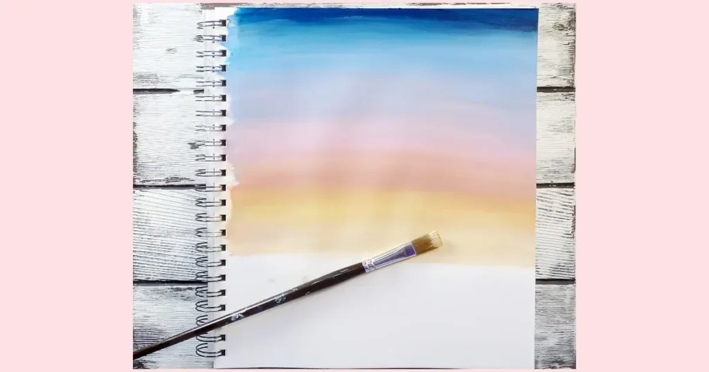
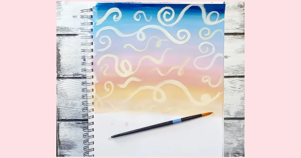
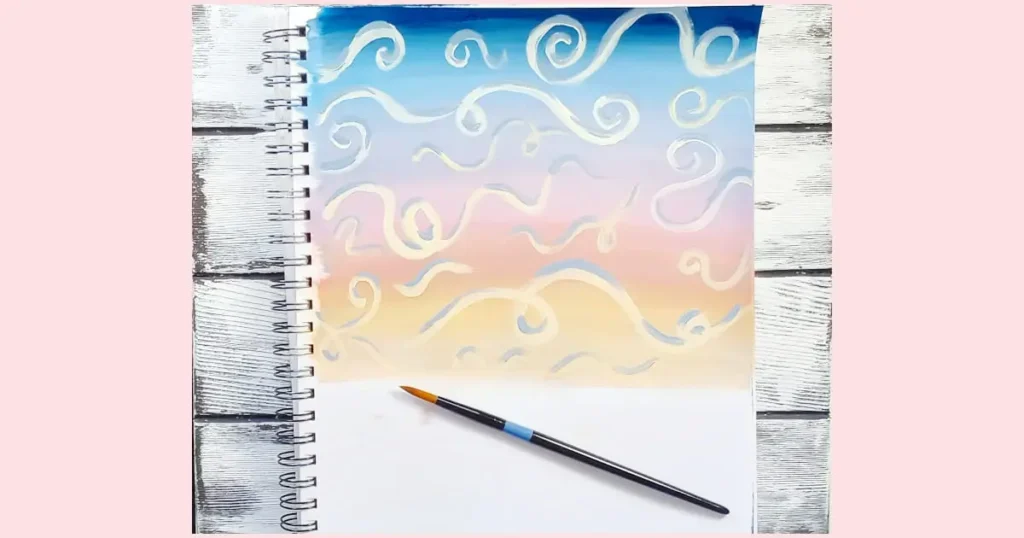
- Using a flat brush to create horizontal brushstrokes, start with a mix of Ultramarine Blue and Mars Black at the top. Wash your brush and gradually add Titanium White to lighten the colors.
- As you move towards the horizon (your horizon will be about ⅔ down the canvas), mix Ultramarine Blue and Alizarin Crimson to create purple, wash your brush and transition to pinks by adding Titanium White to Alizarin Crimson. When you reach the lower part of the sky, start incorporating Cadmium Yellow Medium to your pink to create peach tones. Finally, wash your brush and use Cadmium Yellow Medium with lots of Titanium White to achieve the warm yellows near the horizon.
- Allow the sky to dry completely before proceeding to add curving spiral-like swirling clouds reminiscent of Vincent Van Gogh’s “Starry Night”.
- Using a medium-sized round brush, load it with a mixture of Titanium White and Cadmium Yellow Medium paint and start swirling clouds across the sky. Use bold, flowing brushstrokes to create movement in the clouds.
- To enhance the depth and dimension of the clouds, mix a bit of Ultramarine Blue and Mars Black with Titanium White to create shades of bluish-gray. Add shadows to the clouds, remembering that the brightest part of the cloud will be the bottom where the setting sun would hit them.
Step 2: Blocking In The Meadow And The River
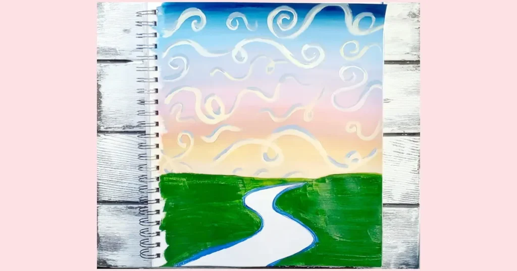
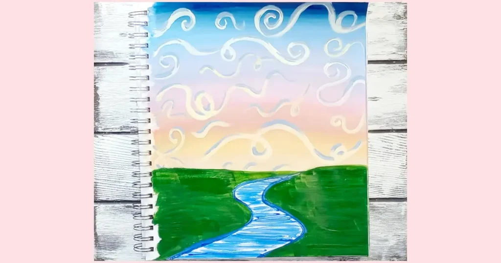
- Using a round brush, start by painting the river in an S-curve that vanishes at the horizon and widens as it flows towards the bottom left of the canvas. Use a mixture of Ultramarine Blue with a touch of Mars Black to create a deep blue color.
- With flat brush, and Hooker’s Green, use broad horizontal brushstrokes to fill in the area designated for the meadow.
- To create texture for the water in the river, use a small flat brush loaded with the dark blue paint mixture to create short, horizontal jagged lines. This technique mimics the movement and texture of flowing water.
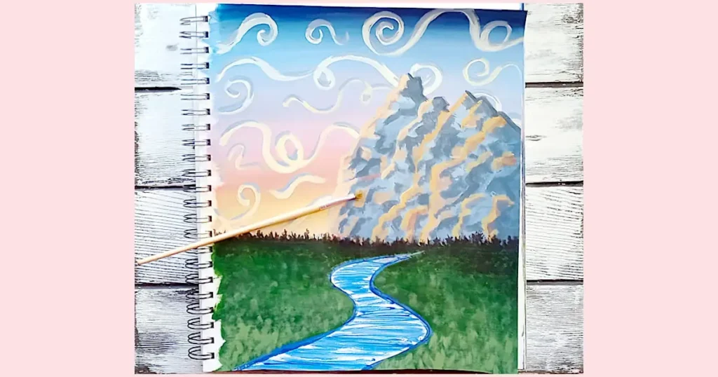
Step 3: Painting The Mountains
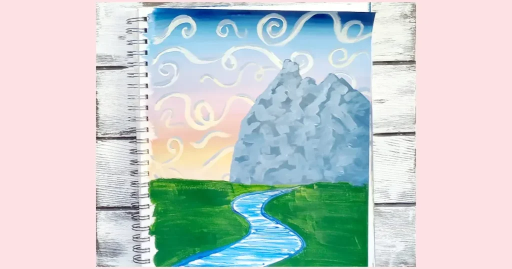
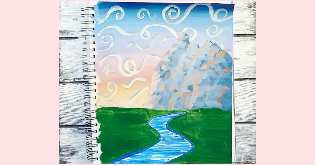
- Begin by mixing a dark grayish-blue color using Ultramarine Blue, Mars Black, and Titanium White. This will be the base color for the mountains.
- Using a medium-sized brush, start by outlining the three peaks of the mountain range on the right-hand side of your canvas and stopping where the sky meets the meadow. Vary the height of each peak to create visual interest and depth in the composition.
- Next, fill in the mountain shapes with the dark grayish-blue paint mixture. Use diagonal brushstrokes to create the sloping sides of the mountains, adding texture and dimension to the rocky terrain.
- Once the base color is applied, mix a lighter shade of blue by adding more Titanium White to the grayish-blue mixture. With a smaller flat brush, add highlights to the peaks and ridges of the mountains, focusing on areas that would catch the last rays of the setting sun. Use a mixture of horizontal and vertical brushstrokes to help give the illusion of jagged edges.
- To depict the reflection of the sunset colors on the rocky faces of the mountains, use a combination of warm hues such as Cadmium Yellow Medium, a touch of Alizarin Crimson, and Titanium White. Apply these colors sparingly on the areas of the mountain that are facing toward the setting sun.
- Lastly, add zigzag lines along the edges of the mountain ridges to enhance the rugged appearance of the rocky terrain. Finish by going back in and adjusting your shadows and highlights until you feel your mountains are “rocky” enough.
Step 4: Painting the Tree Line
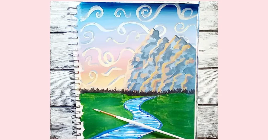
- Use a small, round brush loaded with a dark mixture of Mars Black and a touch of Ultramarine Blue.
- Paint a series of short, vertical irregular lines across the horizon to represent the distant tree line.
- Vary the length and thickness of the lines to create a natural and organic appearance, you don’t want it to look like a bunch of sticks poking out of the ground.
- Allow the lines to overlap slightly and create clusters to mimic the density of a tree line.
- Keep the brushstrokes loose and impressionistic to capture the essence of distant foliage.
Step 5: Adding Texture to the Meadow
- Using a stippling brush (or an old scruffy brush), lightly dab it into a mixture of Hooker’s Green with a bit of Mars Black added.
- With a gentle touch, create short and stubby, vertical strokes and dots throughout the shadowy meadow area. This is just a series of flicks, taps, and scribbling. Don’t worry about making it perfect – imperfection adds character!
- Add quite a lot of this shadow grass beneath the tree line and where you feel the shadow cast from the mountain would cover the meadow. As you move away from the darkest areas, be more random with the shadow color. These shadows will help ground your painting and add a touch of realism.
- Clean your brush and mix a bit of Cadmium Yellow Medium and Titanium White with your Hooker’s Green to create a lighter color. Now, lightly apply this mixture to areas where what’s left of the sunlight would hit the grass. Focus on the grass blades near the bottom of the canvas, since this area wouldn’t be affected as much by the distant tree line or the mountains.
- Paint the blades of grass, closer to the viewer (so near the bottom of the canvas), a bit thicker and longer. This step adds dimension and brings your meadow to life, but keep it understated to maintain the natural feel of the scene.
Step 6: Adding the Foreground Trees
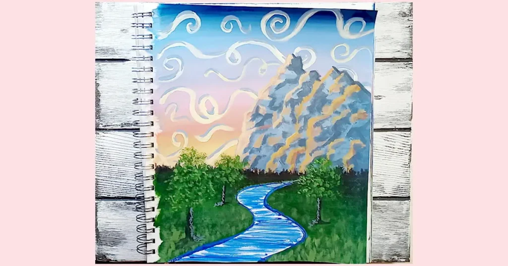
- Taking into account the river’s presence in the meadow, aim for balance by positioning two of the trees to the left of the river and one to the right.
- Utilize a small round brush to mix Mars Black with a touch of Ultramarine Blue, producing a deep, shadowy hue.
- Ensure the trees are staggered, with one tree slightly to the left, another further left, and the third to the right of the river.
- Start by just making a line for each of the tree trunks in the right height and width (tip: the further back you go, the shorter and skinnier your line should be)
- With the same brush, paint the trunks of the trees using the dark color mixture. Start by outlining the shape of each trunk, then fill it in using vertical strokes.
- At the bottom of each trunk, paint a series of bumpy horizontal lines coming from the base of the tree trunks. This is to ground your trees by giving them a few roots.
- Switch to a deer-foot stippler or an old paintbrush with splayed bristles. Dip the stippler or brush into a mixture of Hooker’s Green and Mars Black.
- Lightly dab the stippler or brush onto the canvas to create clusters of foliage on the trees. Focus on being random with your dabbing, leaving some spaces between clusters to suggest depth and variation (and don’t forget to cross over your tree trunks a few times).
- Next, add a bit of Cadmium Yellow Medium to your Hooker’s Green and stipple a few lighter sections of leaves where you feel the sunset light would hit the foliage. Don’t add too much or your leaves will be too light for the setting of the painting. The goal is to create definition between the trees and the background without getting so bright that it feels out of place with the darkness of the rest of the composition.
- Add a bit more yellow and white to your Hooker’s Green, and using a small round brush, dot and squiggle a few brighter highlights in the foliage of each tree where you feel the last of the light would be hitting them.
- Using a fine round brush, mix a slightly lighter shade of the trunk color by adding Titanium White to the Ultramarine Blue. Apply this lighter color to the areas of the trunks where the light would hit, and underneath the trees to create dimension, using the cross-hatching technique (this is just making a bunch of thin parallel lines and then crossing over them with more parallel lines to create a grid, of sorts).
Step 7: Finishing up the River
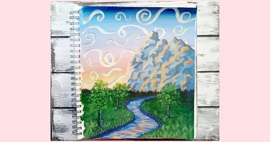
- Dip a small round brush into a mixture of Ultramarine Blue and Mars Black to create a dark color for the riverbanks.
- Begin painting the riverbanks directly onto the canvas using short, intersecting brushstrokes, forming a cross-hatch pattern (instead of “x” shapes, try making “+” shapes).
- Adjust the pressure and direction of your brushstrokes to vary the thickness and density of the lines.
- Continue building up layers of cross-hatching until the riverbanks have the desired depth and definition.
- Allow the paint to dry before proceeding to the next step.
- Mix Hooker’s Green with a touch of Mars Black to create a dark green color for the grass.
- Along the riverbanks, use a small liner/script/round brush to paint irregular patches of long grass, focusing on areas where the meadow meets the bank’s edge.
- Apply the green paint in short, upward strokes to simulate the texture of grass, varying the height and density of the patches to create visual interest.
- Allow the patches of grass to overlap slightly with the riverbank and blend into the surrounding meadow, ensuring a seamless transition between the two areas.
- Make sure that the grass gets smaller and skinnier as it fades into the background.
- Next add a bit of Titanium White to your Hooker’s Green and add just a very few highlights to the grass near the tops of the blades. Don’t add too much and keep those lines skinny!
- With a thin brush and shades of the sunset colors (Cadmium Yellow Medium and Alizarin Crimson), carefully paint horizontal lines across the river to represent reflections of the beautiful sky above.
- Make sure to leave some of the water without any reflections along the riverbank. That will make the bank appear to be deeper in some spots.
- Your reflection lines should be thicker and more intense as they get closer to the bottom of the canvas. This gives the impression that the river is flowing toward you which will create depth in your overall painting.
- Lastly, go back in and make any adjustments (like if you painted over your riverbanks, grass, etc.)
| Lines Used In The Sunset Tutorial | Where The Lines Were Used |
|---|---|
| Line in Art / Technique | Composition Element |
| Horizontal Brushstrokes | Sunset Sky, River Reflection Lines |
| Curvilinear Swirling Brushstrokes | Clouds |
| Diagonal Brushstrokes | Mountain (Sloping Sides) |
| Zigzag Lines | Mountain Ridges |
| Vertical Irregular Lines | Distant Tree Line, Meadow Grass, Tall Riverbank Grass, Tree Trunks |
| Stippling | Meadow Grass |
| Cross-Hatching | Riverbank, Tree Trunks, Shadows Under Trees |
| Curving Lines | S-Shape of River |
Beginner-Friendly Exercises
Practicing different lines in art is like learning the alphabet before writing a story. These exercises are the building blocks of visual expression, providing essential skills. As you master various brush strokes, you’ll delve into a realm of artistic expression, each stroke infusing your painting with its unique vibe. It’s akin to learning a secret language of creativity, enriching your artwork with mood and texture. With continued practice, your confidence grows, creating a solid foundation for your artistic journey, like building your own creative playground on the canvas.
- Straight Line Exercise: Using a flat brush, practice painting straight lines of varying lengths and thicknesses on a canvas or paper. Experiment with different pressures and brush angles to achieve different effects, from thin, delicate lines to bold, thick strokes. Try painting straight lines vertically, horizontally, and diagonally to develop control and precision.
- Curved Line Exercise: Begin by painting various curved lines of different shapes and sizes using a round brush. Start with simple wavy lines and arcs, then progress to more complex shapes like circles. Finally, experiment with lines that exhibit curvilinear qualities, such as the swirling clouds with flowing tails or the rippling shape of sand dunes in a desert scene.
- Zigzag Line Exercise: Paint zigzag lines across the canvas using a flat or angled brush. Vary the length and frequency of the zigzag pattern to create visual interest. Experiment with painting zigzag lines in different directions and angles to understand how they can convey movement and energy in a composition.
- Scribble Exercise: Use a round brush or a palette knife to create expressive scribbles on the canvas. Allow yourself to paint freely without worrying about creating specific shapes or forms. Focus on the rhythm and flow of your movements, exploring how different brush strokes can convey emotion and energy.
- Cross-Hatching Exercise: Practice cross-hatching by painting a grid of intersecting lines on the canvas. Experiment with varying the spacing and angle of the lines to create different densities and textures. Use cross-hatching to add shading and dimension to simple shapes or objects, such as spheres or cubes.
- Stippling Exercise: Dip a stippling brush or an old, splayed brush into acrylic paint and practice stippling (tapping small dots) on the canvas. Explore different densities of stippling to create areas of light and shadow. Experiment with stippling to create textures such as foliage, clouds, or rough surfaces.
- Freeform Line Composition: Create a composition using only lines, without worrying about representing specific objects or scenes. Experiment with combining different types of lines—straight, curved, zigzag, etc.—to create dynamic and expressive compositions. Focus on exploring rhythm, balance, and movement within your composition, using lines to convey emotion and atmosphere.
Exploring Art Styles And Line
Checking out different art styles is like opening up a treasure chest of ideas for your own artwork. When you look at how artists in different styles use lines, it’s like discovering new tools to play with in your own creations. So, by trying out these different techniques, you’re not just learning new stuff – you’re finding cool ways to make your art even more awesome.
Impressionism: Think of Claude Monet’s “Impression, Sunrise“. In this iconic painting, Monet used loose, expressive brushstrokes to capture the fleeting effects of light and atmosphere. Notice how the lines are not sharply defined but rather blend together to evoke a sense of movement and spontaneity.
Cubism: Pablo Picasso’s “Les Demoiselles d’Avignon” is a prime example of Cubist art. Here, Picasso fragmented forms and depicted multiple viewpoints simultaneously, creating a dynamic composition of geometric shapes and angular lines. Experiment with breaking down objects into basic shapes and exploring the interplay of lines in your own work.
Surrealism: Salvador Dalí’s “The Persistence of Memory” showcases the dreamlike, fantastical imagery characteristic of Surrealism. Dalí used fluid, organic lines to depict melting clocks and distorted landscapes, inviting viewers into a world of subconscious exploration. Try incorporating surreal elements into your artwork and let your imagination take center stage.
Abstract Expressionism: Jackson Pollock’s “Number 1A, 1948” exemplifies the spontaneity and gestural energy of Abstract Expressionism. Through his iconic drip painting technique, Pollock created a web of intricate lines that express raw emotion and subconscious impulses. Experiment with intuitive mark-making and embrace the freedom of expression in your own artistic practice.
Pop Art: Roy Lichtenstein’s “Whaam!” is a bold, graphic representation of Pop Art aesthetics. Lichtenstein employed thick, black outlines and Ben-Day dots to emulate the style of comic book illustrations, transforming everyday objects into iconic symbols of popular culture. Explore the use of bold lines and vibrant colors to make a statement in your artwork.
Ignoring line in art is akin to drowning your coffee in milk – you’ve still got coffee, but where’s the flavor?
Sara, Artist (Squishing Paint)
Troubleshooting Tips
| Common Problems or Mistakes | Solutions and Guidance |
| Uneven or Wobbly Lines | – Practice steadying your hand and controlling your movements.- Use your arm and shoulder instead of just your wrist for smoother lines.- Adjust the grip on your tool to find what feels most comfortable and stable.- Use your painting surface to “lean” against but be mindful of wet paint. |
| Overworking or Underworking Lines | – Experiment with varying pressure and stroke speed.- Practice light, confident strokes for delicate lines and slower, firmer strokes for bolder lines.- Be mindful of the amount of paint on your brush.- Extra water on your brush can help your brush glide across the canvas. |
| Inconsistent Line Quality | – Focus on deliberate and intentional mark-making.- Plan out your lines before executing them and pay attention to details like line thickness, spacing, and direction.- Regularly assess your progress and make adjustments as needed. |
| Difficulty Controlling Line Direction | – Practice drawing lines in different directions and angles.- Use reference lines or guides to help maintain alignment and consistency.- Break down complex shapes into smaller, manageable segments. |
| Lack of Confidence in Line Making | – Build confidence through consistent practice and experimentation.- Start with simple exercises and gradually challenge yourself with more complex techniques.- Embrace imperfection and view mistakes as opportunities for learning and improvement. |
Final Thoughts on Line Types for Art
We’ve taken a deep dive into the world of line in art, and what a ride it’s been! From mastering different line techniques to exploring how famous artists use lines in their masterpieces, you’ve picked up some pretty cool tricks along the way.
But hey, this isn’t just about learning new skills – it’s about unleashing your creativity and having fun with your acrylic paintings. By getting cozy with those lines, you’re not just painting; you’re telling stories and expressing yourself in ways you never thought possible.
So, keep on practicing those lines, and keep in mind, perfect lines are fine but it’s those wonky lines that hold the magic! Embrace the imperfections, learn from them, and keep on creating. Your artistic journey is just getting started.