Meet the Author

Artist | Owner of Squishing Paint | Educator - Sara brings over 40 years of creative experience, a decade of specializing in acrylic painting, and a passion for guiding new artists as they embark on their own artistic journeys


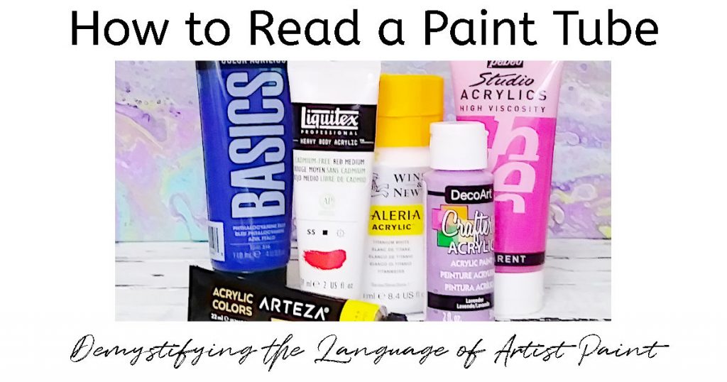
Demystifying an Acrylic Paint Tube Label can Save You time and money
Have you ever tried to read a paint tube but couldn’t understand what the heck it all meant? Although it may seem like some form of hieroglyphic, all of those symbols will help you when painting your masterpiece.
Imagine knowing how transparent a paint will be, or how prone to fading it could be. These are tips that are very helpful when planning a painting.
I know it may seem like a bunch of mumbo jumbo but don’t panic, friend. I’m going to go through every part of the paint label so you can make informed decisions the next time you purchase a tube of acrylic paint.
Name of the Paint Color
The first, and most obvious, thing you’ll notice on a paint tube is the name of the paint color. Sometimes, these names can simply be the pigment used to create the color but, other times, it can be more of a marketing name such as “Sky Blue” or “Grass Green”.
Marketing names are meant to help you visualize what the color will resemble once dry on your canvas. It’s a brand’s way of helping you to choose the very best color for your product. There’s a big difference between the names “Prussian Blue” and “Midnight Blue”, right?!
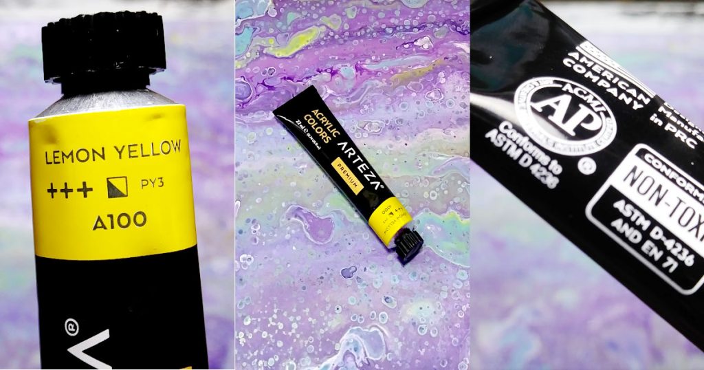
Color Index
If you look on a tube of acrylic paint and see something like “PR122” or “PW6”? Those weird letter and number combinations are what are known as Color Indexes. It’s a way to tell you what pigment was used in the production of the paint color.
In the example above, PR122 is Quinacridone Magenta, and PW6 is Titanium White. The “P” in both examples just stands for the word “Pigment” but the “R” stands for red and the “W” stands for white. You’ll also see things like “PB” (Pigment Blue), “PY” (Pigment Yellow), etc.
Additionally, the number listed at the end of the color index code is the chemical compound within the paint. It’s a whole lotta science stuff so blah, blah, blah, right?
Hold on, though, having this info can be very useful to you. Knowing how to read the color index code on a paint label can help you to interpret the general recipe of the paint color. Let’s say you’re following a YouTube tutorial and the artist is using Golden’s Heavy Body Prussian Blue Hue but you don’t have that color. This is where the color index comes in.
The pigment code/color index for Golden’s Prussian Blue Hue is PBk 9/PB15:0/PV23. This means that Golden’s Heavy Body Prussian Blue Hue is a mixture of Bone or Ivory Black (PBk9), Phthalo Blue (PB15), and Dioxizine Violet/Purple (PV23).
How is this helpful to you? Well, if you’re lucky enough to have lots of other paint colors to choose from, you can make your own Prussian Blue! Keep in mind, the color index only tells you WHICH pigment is being used but not HOW MUCH of each pigment. This is why you can have the same paint color from two different brands and they don’t look exactly alike. Each Company has its own “secret recipe”. As I’ve said many times before, embrace the imperfect! It’s okay if your painting looks unique and not a replica of a tutorial you may be following.
Another benefit to knowing the color index/pigment code is so that you can make a more informed estimation of the tinting strength and/or the opacity of the paint color. Have you ever noticed how you only need a small amount of phthalo blue or it will overtake any other colors mixed with it? Yeah, like that.
So, before mixing up a bunch of paint with other colors, make sure to do a quick google to check out the details of each pigment so you don’t end up with a bucket’s worth of a paint color that you only needed a cap full of.
This can also help you at the paint store. Let’s say you found a YouTube Tutorial that you are totally fired up to try but, when you checked the list of paints needed in the description box, you realized that you didn’t have a certain color. Off to the art store at once! To your shock and dismay, you see that they are currently out of the paint color you need!
This, my dear friend, is where the color index code comes to the rescue. If you know what pigments are in the paint color you need, you can easily find replacements to mix up your own color or to find a pretty close substitute.
One last thing to note is that you may run across two different paint colors that have the same color indexing code. What this means is that the same pigment has been used in both colors but the pigment has been altered in some way. A good example of this is Raw Umber, Burnt Umber, and Burnt Umber Light. All three of these paint colors use the color index code of PBr7.
When the Marketing Name Includes the Word Hue
When you read a paint tube and come across the word “hue” it’s an indication that a more “modern” pigment has been used in the creation of the paint.
This is typically done because the original pigment is toxic (such as cadmium) or to cut back on the cost to make the paint color. It could also mean that the original color is no longer available and so a synthetic (manmade) version is used instead.
No matter the reason, the word “hue” doesn’t necessarily mean that the paint color is not as good as the original. It’s just informing you that it isn’t the original but it’s pretty darn close!
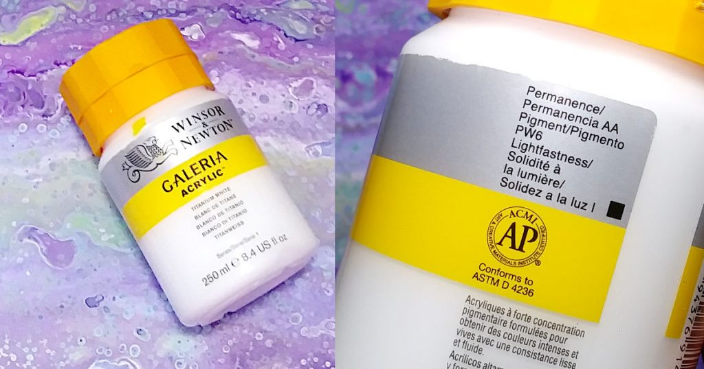
Permanence of the Pigment
In simple terms, this is a rating that lets you know how well a certain pigment can stand up to environmental factors such as heat, humidity, cold temps, and more. Basically, anything that can happen in the real world and not in some temperature controlled, vacuum sealed, titanium-plated vault….. well, okay, that may be going a bit far but you know what I mean.
Lightfastness
Lightfastness is part of the permanency rating. It tells you how well the paint can handle sunlight which can cause fading over time. If you read a paint tube and happen to see the word “fugitive”, in relation to lightfastness, this means that the paint will fade over time.
The ASTM (American Standard Test Measure) scale for lightfastness is a rating between I and V, meaning the lower the number on the scale the better the pigment can stand up to sunlight exposure. They put the pigments through rigorous accelerated testing that include subjecting the pigment to sunlight, either actual sunlight or artificial sun lamps/bulbs.
The ASTM rating is as follows:
- V rating (Very Poor): lifespan of less than 2 years under normal average conditions
- IV rating (Poor): lifespan of 2-15 years
- III rating (Fair): lifespan of 15-50 years
- II rating (Very Good): lifespan of 50-100 years
- I rating (Excellent): lifespan of over 100 years
Lightfastness can be represented by different symbols, such as plus signs (Arteza), numbers (Liquitex Basics), a sun symbol with a number inside of it (Liquitex Heavy Body), or roman numerals. There are probably other symbols not included in the article because, unfortunately, there doesn’t seem to be standard label practices at the moment.
Series Number of the Paint
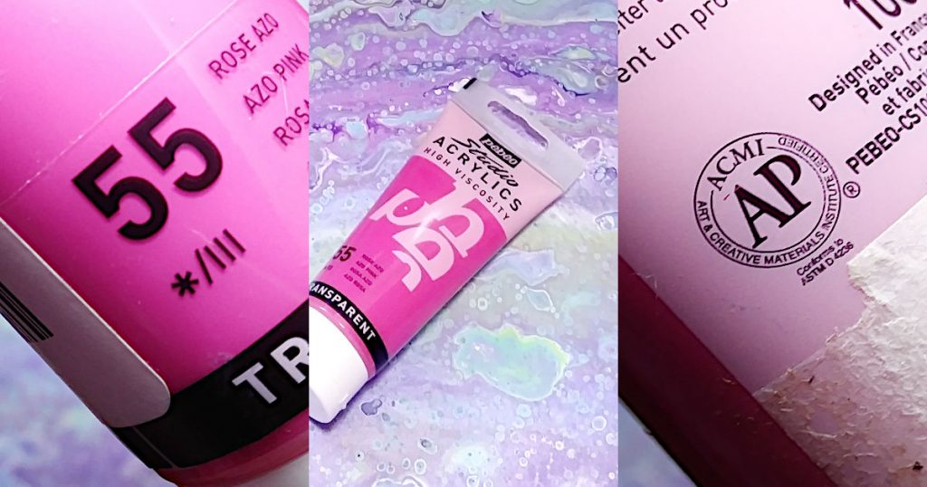
The purpose of the series number is to give you a general idea of how expensive the paint is. It goes from 1, being least expensive, to 5, which is most expensive.
The cost of a tube of paint can vary significantly. One of the biggest reasons is due to the pigment used. Some pigments are easier to source and process than others. This is one of the reasons why I always recommend upgrading your Titanium White first. It’s a series 1, so cheaper, and the coverage is much better when you use the heavy body version.
Opacity Rating
You know those squares you see when you read a tube of paint? Those are the symbols used to show you the opacity rating.
Most paint will be labeled with a square filled in with color, a square that’s half colored, a square with a colored line running diagonally from one corner to another, and a square with no color in it at all.
So, what does it mean?
- Color Filled Square = Opaque
- Half Colored Square = Semi-Opaque
- Square with Colored Line = Semi-Transparent
- Square with No Color = Transparent
You may, also, see a paint swatch on the front of the paint label which can give you a general idea of how opaque/transparent a paint is.
Additionally, sometimes you run across a paint manufacturer that doesn’t use the standard symbols. Golden Artist Colors, Inc. has a sliding scale, from low to high, which is labeled as Tinting Strength.
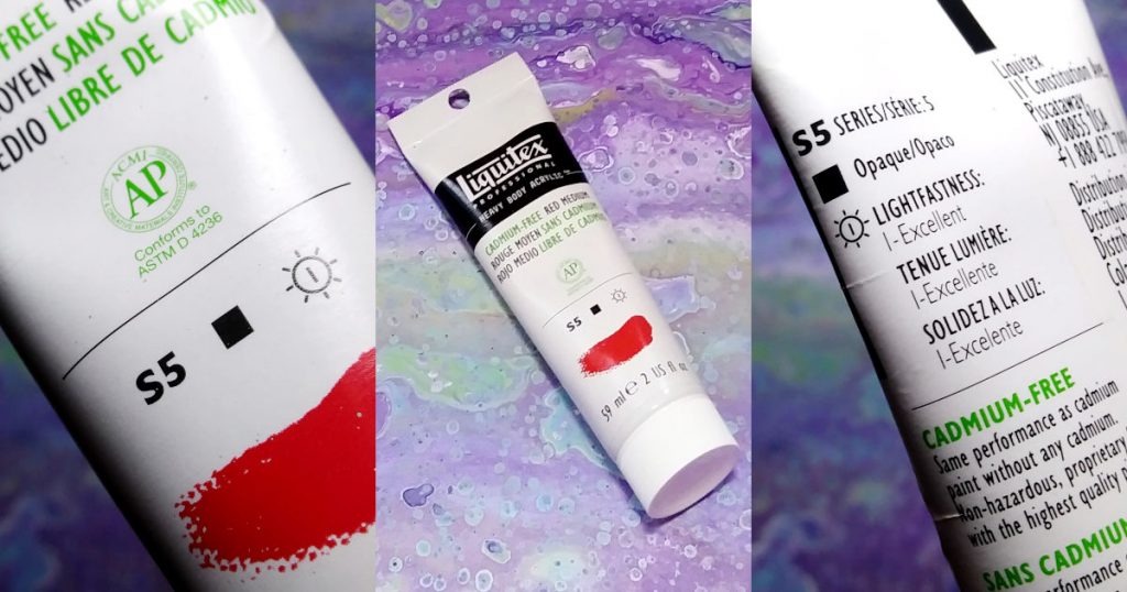
Conforms to ASTM D 4236
This is a biggie! When you see “Conforms to ASTM D 4236” on a tube of paint, it means that it is properly labeled for any health hazards resulting from exposure. If a paint contains any type of toxic ingredient, you must be informed somewhere on the label.
The Cadmium paints are a good example of this. Real Cadmium has been scientifically proven to be toxic in large amounts. Whether or not the amount of real cadmium used in acrylic painting is a health danger, is a constant debate.
To be on the safe side, you can rest assured that if you read a tube of paint and it proudly states “Conforms to ASTM D 4236” you will be able to find any health cautions or warnings somewhere on the label.
PS: If using real Cadmium paint freaks you out, you can always go for the Cadmium Hue. Liquitex has also come out with heavy body Cadmium free paints that have been blind tested to see if they compare to the real Cadmiums. The word on the street is that they’re petty awesome. From experience, I love my Liquitex Cad. – free paint! It has great coverage and still gives that lovely glow effect that the Cads are well known for.
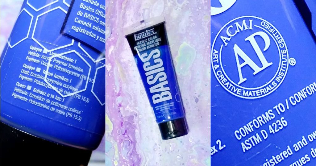
ACMI Stamp
You can find the ACMI stamp on pretty much all labels for acrylic paints. The Art & Creative Materials Institute, Inc. includes a stamp on acrylic paint so you can rest assured that it has been evaluated by a certified toxicologist.
If you see an “AP” in the center of the seal, that means that it is an “Approved Product” for adults and children. On the other hand, if you see a “CL” in the center of the seal, it means “Cautionary Labeling” is required and to follow all instructions for safe use and handling.
Make sure to check out the ACMI website where you can find more information.
Viscosity/Consistency
When you read a paint tube, the manufacturer will sometimes let you know what the viscosity of the acrylic paint is going to be. There are different viscosity levels and each is given a different description according to thickness.
- Heavy Body – this will be the thickest paint and has the consistency of soft whipped butter
- Soft Body – reminds me of the consistency of melted ice cream (great for paint pours)
- Fluid/Inks – very runny (can be used to create a watercolor effect)
You will hear the term “Student Grade” being talked about in art circles and while this can have something to do with the viscosity being somewhere between heavy body and soft body, it’s more about the amount of pigment used to create it.
Student grade paints have less pigment than professional grade, which can come in any of the viscosities listed above. So, just be aware that student grade paints are about the pigment load.
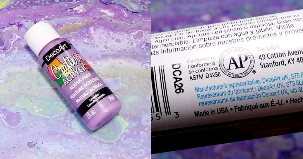
What About Craft Paint?
I know a lot of beginner artists start with craft paint because of the affordability and how easy it is to get your hands on a bottle. That said, you’re going to have to do additional research, or testing, to find out all of the details.
I’m sure you’ll notice that your bottle of craft paint doesn’t have as much information included on its label. I mean, it probably has the ACMI seal and the ASTM conformity but what about all of the other important info?
I have lots of different colors of DecoArt Crafter’s Acrylic Paints that I got from the local dollar store. When I go to the website, it does give me some additional info, such as lightfastness. It also tells me that it may take more than one coat to get the desired coverage. It is worth noting that DecoArt’s Americana line does have an opacity chart that you can download.
I am a big advocate of starting your painting journey with craft paint. Once you’ve figured out whether acrylic painting is going to become a regular part of your creative life, then you can start to upgrade as you run out of craft paints.
An Acrylic Paint Label Holds Valuable Info
The next time you read a paint tube you’ll be able to understand what the squares mean, the difference between an approved product and cautionary labeling, how thick the paint is, and so much more.
If you are a beginner and are using craft paint, you can possibly find more info on your paints with a quick google search.
As they say, “All knowledge is worth having” and, in the case of your acrylic paint, this is so true. Knowing what everything means can help you to choose your paint wisely when purchasing and will also save you time in the long run by knowing what to expect when painting your next project.
wow! this is probably more information that i expected, but, THANK YOU FOR IT ALL !
Im still learning how to combine different paints according to their opacity, i.e.
i do lots of pour painting styled and studies many videos from painters in that field, but there’s so much to still learn.
thank you again,
You are so very welcome and thanks for dropping by! My favorite thing about painting is that there is always something new to learn and new experiments to try. When it comes to reading a paint tube, I feel like the more you know, the better chance of success. Happy Painting!