Meet the Author

Artist | Owner of Squishing Paint | Educator - Sara brings over 40 years of creative experience, a decade of specializing in acrylic painting, and a passion for guiding new artists as they embark on their own artistic journeys


Some of the links in this article are affiliate links which means that if you choose to click on them and make a purchase, I earn a small commission at no extra cost to you.
Also, as an Amazon Associate, I earn from qualifying Amazon purchases.
For more details, please read the full disclosure here.
Thanks so much for your support!
If you’re struggling to substitute acrylic paint colors for the paint used in your favorite YouTube painting tutorial, this article is for you!
Today, I’m going to explain why perfect matches with alternative paint colors can be challenging. Next, I’ll get you started by converting a popular line of paint, then I’ll show you how you can convert any paint brand color to whatever you have on hand. Plus, we’ll talk about metallic and florescent paint and, finally, I’ll give you some handy links to color charts from some popular acrylic paint brands. Without further ado, let’s dive in!
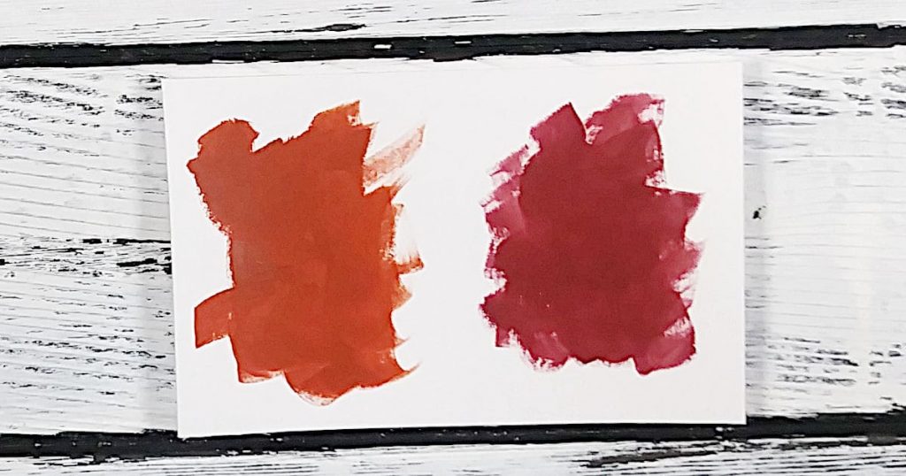
Adding a bit of yellow to the Barn Red would help warm it up to be a close dupe for Red Oxide.
Why Your Substitute Color May Not Be An Exact Match
Right off the bat, no matter how hard you try, you may never find an exact match for a paint color. We’ll go over it in more detail but, basically, these are some of the reasons why it’s challenging to substitute acrylic paint colors:
- The transparency is not the same between brands
- The pigments may have different marketing names
- The recipe used to create the color may be unique to the brand
- If you’re using the color index code to try to recreate a paint color, the pigment may be processed in a different way
These are just some of the issues you can face that make the process of substituting paint colors……complicated. Let’s look a little closer at these stumbling blocks.
Pigment Processing Matters
A perfect example of two colors sharing the exact same pigment would be Raw Umber and Burnt Umber.
The only difference between these two colors is that the pigment has been processed differently (literally burnt).
By looking at the color index code on a tube of Liquitex Basics, you can see that both Burnt Umber and Raw Umber are made from brown iron oxide and other brands sell brown iron oxide paint. However, just because you have a bottle of brown iron oxide paint doesn’t mean it will be an exact match.
You may get close to Raw Umber but it won’t be exactly the same if you’re trying to match Burnt Umber.
It’s All In The Paint Recipe
Every paint brand has its own formula for how they make each color of paint. So, even if you have two different brands of paint with a paint color that share the same name, the same pigments, the same everything, I hate to tell you this, but they could still be different.
As someone who used to formulate bath and body products, I am well acquainted with using pigments and mixing them to create new colors.
First of all, the two paint brands could be sourcing their pigments from different suppliers who mine their pigments (or manufacture them) in different locations and, believe it or not, that is enough sometimes to create a big difference.
The other issue is that there is no way of knowing exactly how much pigment is being used in a formulation. This is especially true for paint colors that are made by mixing different pigments.
For example, you may have a turquoise paint from two different brands that both use a combination of phthalo blue, phthalo green, and titanium white BUT maybe one brand uses more green than blue and the other one uses more white than green.
These are subtle differences that can make a huge difference.
Marketing Names Can Be Different
You see this most frequently when you’re trying to substitute acrylic paint colors with craft paint.
When I first started painting I only used craft paint from the local dollar store. I wanted to make sure that I was going to like acrylic painting first before spending money on higher quality paints.
The problem I faced, and I’m sure you’re facing as well if you’re using craft paint, is that I had paints like “straw”, “midnight blue”, and “cherry red” while the instructors were using colors like “yellow oxide”, “Prussian blue”, and “naphthol crimson”. I could literally feel my brain exploding!
In the list of problems you can come across this one isn’t too bad. As long as you can look at a color and create a description for it. You’ll see examples of my descriptions a bit later.
Different Levels of Paint Transparency
This is the least worrisome challenge and the one that is most easily fixed, in my opinion, but it’s still worth mentioning.
Different paint colors, and brands, can have different levels of transparency. This can cause you to think that you’re using the wrong paint color but it could be that you just need to add more layers.
This can happen with craft paint as well as student grade paint. It has to do with the amount of pigment used in the paint and, also, the quality of the pigment.
A lot of craft paints have less pigment load which means that it takes a lot more paint to get the same effect as you would with two swipes of a student grade and one swipe of a professional grade.
That doesn’t mean that you shouldn’t use craft paint. In fact, I’m a big advocate for starting with craft paint because it’s inexpensive and easy to get your hands on. The most important thing, when you’re first starting to paint, is to get painting!
That said, as soon as you can afford it, and you’ve decided you can’t live without the joy of painting with acrylics, you should consider slowly upgrading. To this day, I use craft paint, student paint, and professional paint. I am most definitely NOT a paint snob, haha!
Converting a Paint Color When You Have None And You Need It NOW!
I’m using every color in the Liquitex Basics line because it’s one of my favorites, I have quite a few tubes, and it’s a pretty popular brand with beginners.
I’ve researched each pigment used in all of the paint colors, I’ve read the specifics for each one, looked at swatches of both the paint color and the pigments used, and I’ve converted the color index codes into actual names so I could see what other paint colors may use the same pigments. The following color substitutions are an educated estimation.
Keep in mind, these are only my findings and my suggestions for alternative paint colors and mixes. Color is one of those fascinating things in life where your interpretation of color can be completely different than someone else’s. After a ton of research, I’ve done my best to make my descriptions as complete as possible.
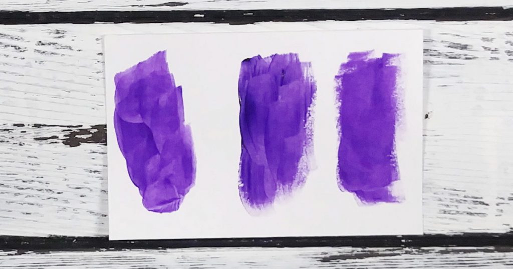
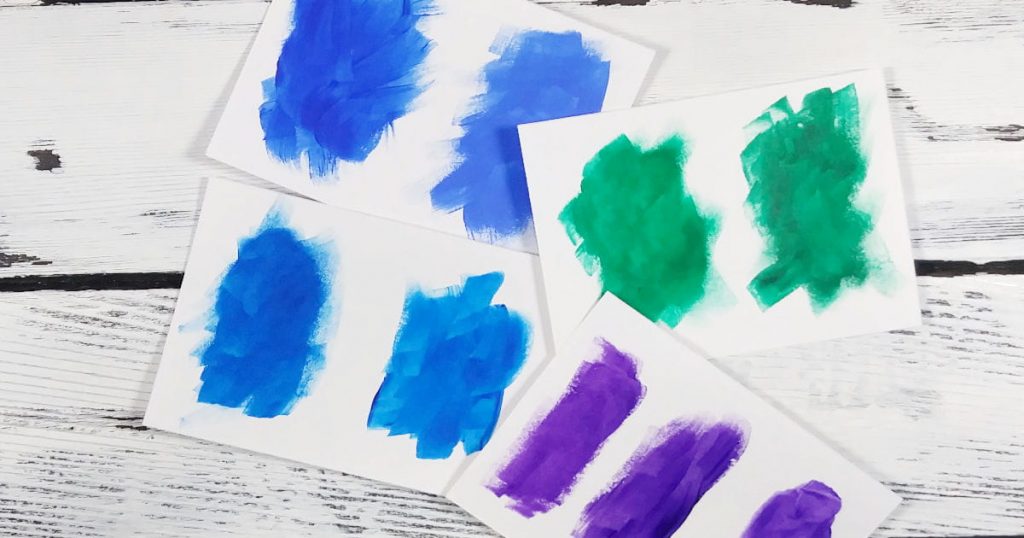
Purple/Violet/Magenta Paint Colors
- Deep Violet
- This is a very dark rich purple with a slight red undertone
- If you have Quinacridone Magenta and Dioxazine Purple, mix together and add a bit of red
- Prism Violet
- Transparent deep purple with a slight brown undertone
- Try the same mix as Deep Violet but add a bit of a brownish red like red oxide or brick red
- Purple Gray
- Mid-tone purple (not too dark, not too light) with a grey undertone
- Try mixing a dark purple with a bit of yellow to dull it down and then add white to lighten
- Dioxazine Purple
- A vivid dark purple with a slight red undertone but not so much as Deep Violet or Prism Violet
- Try using a royal jewel toned purple
- Brilliant Purple
- Mid-tone (not too dark, not too light) purple
- Try mixing a royal jewel toned purple with white
- Medium Magenta
- A pinkish purple with cool undertones
- If you have Quinacridone Magenta, mix it with white or you could mix any magenta that leans more toward purple with white to create a mid-tone pinkish purple color
- Quinacridone Magenta
- A vivid mid-toned (not too dark, not too light) purple red mix
- Try mixing a cool toned purple, a little bit at a time, with a cool toned red
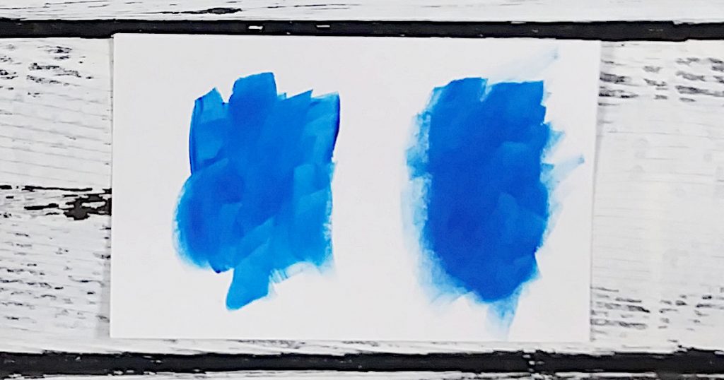
Blue/Turquoise Paint Colors
- Light Blue Violet
- A mid-toned cool blue
- If you have dioxazine purple and ultramarine blue, mix together with white or use any light blue paint color that has a bit of purple added
- Cerulean Blue Hue
- The perfect blue for a rich blue sky
- You could try mixing ultramarine blue with phthalo blue, then add just a titch of phthalo green, and finish by adding white to your liking
- You could also use any blue paint that is the color of the blue sky (directly overhead because that’s the richest color) on a cloudless sunny day
- Brilliant Blue
- This is another sky blue but with more pronounced green undertones (but it’s still definitely blue!)
- You can try to achieve this color by mixing phthalo blue, phthalo green, and white
- You could also look for any sky blue that has a slight green tone to it
- Light Blue Permanent
- Again, this is another sky blue that is lighter than both Cerulean Blue and Brilliant Blue
- You could try mixing phthalo blue, green, and white until you achieve a close substitute or you could find a light turquoise that’s much more blue than green
- Turquoise Blue
- A beautiful rich turquoise color that has much more green in it but is still more on the blue side
- Try mixing phthalo blue with slightly less phthalo green and add white
- You could also use whatever deep turquoise color you have that is just a tiny bit more blue than green
- Prussian Blue Hue
- This is a very deep dark blue that reminds me of the night sky
- Substitute acrylic paint colors you could try mixing together would be Phthalo blue with diox purple and a titch of black (warning: black can take over a mix in a heartbeat so tread lightly!)
- Another suggestion would be any paint color you have that mentions Midnight Blue, etc.
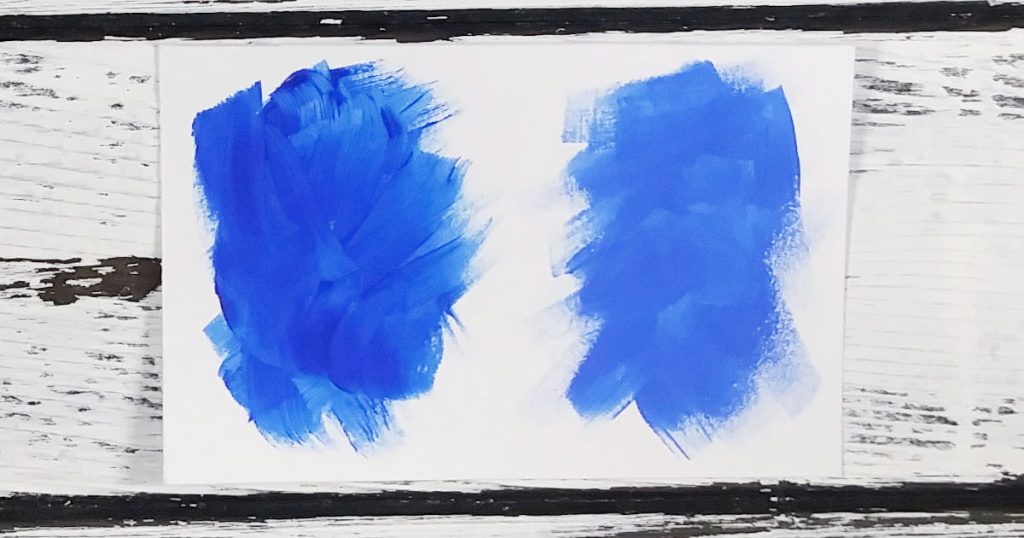
- Ultramarine Blue
- A rich deep blue with very slight green undertones
- I would describe it as a more vibrant Navy Blue (she’s got some pep to ‘er!)
- Think along the lines of ocean blue on a sunny day (but, definitely NOT a turquoise like you see near the shoreline)
- Cobalt Blue Hue
- A rich blue with very subtle green undertones
- This is almost like Ultramarine blue but more vibrant
- You could experiment by mixing Ultramarine Blue with Phthalo Blue and adding in just a bit of white
- Phthalocyanine Blue
- This is a very vivid blue with a green undertone (a little goes a long way!)
- My take on this color is that it has an intensity to it that’s hard to recreate
- I would look for any vibrant blue that has a cool green undertone (it should be warmer than any substitute acrylic paint colors you’re using for Ultramarine Blue and Cobalt Blue
- ORRRR, take a look at Primary Blue from the same brand (listed below!)
- Primary Blue
- As you can see from my photo, this is the same as Phthalocyanine Blue (at least in this line of paint) so follow the same advice as given above
- Blue Gray
- A medium toned grey with a blue undertone
- Try mixing Phthalo Blue (or alternative) with Ultramarine Blue (or alternative) with white and black
Green/Aqua Paint Colors
- Bright Aqua Green
- Vibrant mid-tone green with blue undertones
- You could try mixing a turquoise color that has much more green than blue and add white
- Light Olive Green
- This is a brownish green earthy color that resembles green olives
- Try mixing any green and yellow, add a tiny bit of red or purple (to dull either the green or yellow down), and then add white
- Lime Green
- A lively shade of bright yellowish green
- A mixing option could be a bright green and bright yellow with white added to lighten
- Brilliant Yellow Green
- A pale shade of yellowish green that reminds me of the lightest shade of green on the outside of a watermelon
- You could try using a bright green with a lemon yellow, then toned down a bit with a straw yellow (yellow oxide), and add white to lighten
- Green Gray
- This is what I would describe as a mid-toned camo green
- An alternative acrylic paint color you could try is a mix of Ultramarine Blue (or alternative) with yellow oxide (or alternative), and then add white
- Bronze Yellow
- This is actually a very earthy color that’s hard to figure out whether it’s green or brown
- Look for any paint color that is a mid-toned green brown or you could try mixing a straw yellow (yellow oxide) with a tiny bit of Mars Black, and add a bit of Red Oxide (or brick/barn red)
- Phthalocyanine Green
- Intense rich emerald green with a slight blue undertone (a little goes a long way!)
- Try mixing a lemon yellow with a dark vibrant blue that has a slight green undertone
- Hooker’s Green Hue Permanent
- This is a dark green with a tiny bit of a yellow undertone
- It reminds me of a forest of evergreen trees so look for any paint that has “woods” or “forest” in it
- You could try mixing together a rich emerald green, with a bit of black and primary yellow
- Permanent Green Deep
- Dark green with a blue undertone
- Try mixing an emerald green with a bit of black
- Light Green Permanent
- A mid-tone green with a slight yellow undertone
- This reminds me of the perfect Christmas green
- Either look for any green that says “holiday”, “Christmas”, “festive”, or you could try mixing an emerald green with a bright sunny yellow and then slowly add white to lighten
Yellow Paint Colors
- Cadmium Yellow Light Hue
- No doubt about it, this is definitely a lemon yellow
- A cool yellow that falls more toward green than orange
- Look for any “lemon” yellow or try adding a tiny amount of a cool green to a slightly warm yellow and slowly add white to lighten
- Cadmium Yellow Medium Hue
- I like to call this paint color “sunshine in a bottle”
- It’s the color of yellow crayons, the sun, and sunflowers
- You could try mixing a primary yellow with another yellow that leans a bit toward orange
- Cadmium Yellow Deep Hue
- This is a deeper, warmer yellow than Cadmium Yellow Medium Hue
- It reminds me of the yellow lines on the highway
- Try mixing together a primary yellow with a bit of a bright red (just a little!) and then add white to lighten, if necessary
- Transparent Yellow
- This is a softened and more transparent version of Cadmium Yellow Medium Hue
- Although you wouldn’t have the same transparency, you could come close to the same color by using a sunny yellow mixed with white
- Primary Yellow
- Primary yellow reminds me of the color of a yellow raincoat
- I think you could come pretty close to this color by mixing a lemon yellow with a sunny yellow
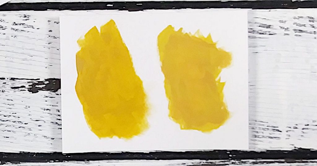
- Yellow Oxide
- This is a very earthy yellow color that reminds me of straw
- As you can see from the photo, I’ve had great success converting this paint color by mixing a straw color with a tiny bit of burnt sienna
- You could also try mixing a primary yellow with burnt sienna and a bit of white
- Naples Yellow Hue
- A pale yellow with a pinkish undertone
- You could try mixing a straw yellow with a bit of orange and add white
Orange Paint Colors
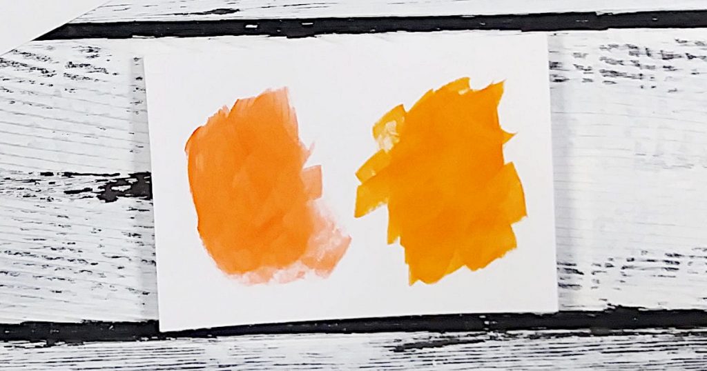
- Cadmium Orange Hue
- This is a bright pumpkin orange
- Look for anything that says “pumpkin”, “bright”, “vivid”, or you could try mixing a bright primary yellow with a bright “tomato” red
- Vivid Red Orange
- This reminds me of baked pumpkin pie (without too many spices, haha)
- I would actually try mixing Cadmium Orange Hue (or alternative) with a bit of tomato red and a bit of white
Red/Pink Paint Colors
- Cadmium Red Light Hue
- This paint color is like a cross between red and orange, leaning more toward red (it looks more orange than red in the bottle but, when compared to Cadmium Orange Hue, it’s definitely redder)
- Good substitute acrylic paint colors would be a warm red with a bright sunny yellow
- Cadmium Red Medium Hue
- Fire engine red
- Take any red you have and either slowly add orange or purple until you reach the desired color
- Cadmium Red Deep Hue
- This is a slightly blue red that works well as a traditional “Christmas” red
- Look for any red paint color that says “Christmas”, “holiday”, “festive” or you could “cool” a red down by adding a bit of magenta or purple
- Naphthol Crimson
- Whenever a paint color mentions “crimson”, channel your inner vampire and think blood
- Any mid-tone (not too light, not too dark) blue red will work as a substitute
- Primary Red
- This is actually made with a violet pigment (say, whaaaa?!)
- Could try subbing with Pyrrole Red
- Primary red is a hard one to recreate but look at all of the reds that you have and line them up next to each other. Then, compare them to one another and figure out which ones are warm toned and which ones are cool toned. From there, separate your cool from your warm and repeat the comparison process until you have one cool toned red left and one warm toned red left. Try mixing those two together and see what happens! Experimenting is a good thing!
- Transparent Red
- As the name suggests, this is a transparent red
- A decent replacement for this red paint color would be a soft red (not really vibrant) with a slight brown undertone
- Alizarin Crimson Hue Permanent
- This is a deep rich blood red with a blue undertone
- I would actually try mixing a raspberry red with a little bit of a very dark cool brown
- Pyrrole Red
- A bright warm red that mixes “clean” with other colors
- Would be a good sub for primary red
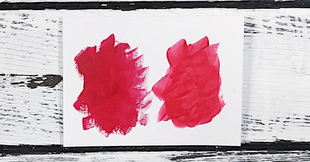
- Red Oxide
- An earthy rust red with a brown undertone
- Try mixing a warm red with a bit of brown and yellow
- Look for any paint color that has “brick”, “barn”, “rust”
- Light Pink (AKA: Light Portrait Pink)
- This is known as both Light Pink and Light Portrait Pink
- It’s a pale soft pink with a yellow tinge
- You could try mixing a rosy red with yellow and adding white
- Look for anything that says “skin”, “skin tone”, “flesh”
- Rose Pink
- This is a mid-tone pink with a blue undertone
- It’s like a dusty rose without the dust (haha!)
- You’re looking for something that is not quite as vibrant or cool as a bubblegum pink but it’s also not pepto bismol either
- Try combining a magenta with white and then add a bit of a straw yellow slowly
Brown Paint Colors
- Raw Umber
- A very rich dark brown that reminds me of melted dark chocolate
- Try mixing yellow oxide, alizarin crimson, and phthalo blue
- Or, mix a straw yellow, with a blood red, and a vibrant blue that leans toward green
- Burnt Umber
- A lighter version of Raw Umber
- Try mixing together Red Oxide, Yellow Oxide, and Ultramarine Blue
- Or, you could try a rusty red, a straw yellow, and a deep ocean blue
- Raw Sienna
- A bright reddish brown with yellow undertones
- To mix, try combining red oxide, yellow oxide, and a bit of black
- Or, rust red, straw yellow, and a bit of black
- Burnt Sienna
- A rich red brown that is darker than Raw Sienna
- An alternative color combination would be the same as for Raw Sienna but add more black
White/Off White Paint Colors
- Titanium White
- The whitest of whites!
- Look for any white that is a true white or a white with a very tiny bit of a blue undertone (“bluing” can make whites seem brighter)
- Transparent Mixing White
- This is also Titanium White but it is way more transparent so be careful not to pick this up if you’re wanting good coverage
- This is great for tinting other colors without getting to the pastel point too quickly
- It’s also good for glazing but you still have to be careful with how much you use
- Parchment
- This is an off white color
- You can try mixing Yellow Oxide, Black, White, and a little bit of Phthalo Green
- Or, try straw yellow, black, white, and a tiny bit of emerald green
- Unbleached Titanium
- A creamy white
- You can mix Titanium White with Yellow Oxide, a titch of black, and a titch of Red Oxide
- Or, try white, straw yellow, black, and rust red
Black Paint Colors
- Mars Black
- Very intense black with slight brown undertones (a little goes a long way)
- You want to choose a black with a high level of pigmentation and great coverage
- Ivory Black
- A very rich black with less of a brown undertone than Mars Black
- Not as opaque as Mars black but great for glazing
- You could use a small amount of Mars Black with a glazing liquid medium to get the same effect
Grey Paint Colors
- Neutral Gray 5
- A mid-tone gray that’s very neutral
- Try mixing Ivory Black, Titanium White, and Yellow Oxide
- Or, a small amount of Mars Black, white, and a straw yellow
- Payne’s Gray
- It seems as though Payne’s Gray is one of those paint colors that differ from brand to brand
- In this case, it’s a very dark bluish gray
- A very popular substitute mix would be ultramarine blue and burnt umber (more blue than brown) and add a bit of white
A Word About Metallic and Fluorescent Paint
When it comes to metallic and fluorescent paint, there’s not much to say about converting. These are specialty paints that pretty much are what they are. So, if you want to try your hand at a painting tutorial that calls for either metallics or fluorescents, you’ll either have to go out and buy some or try subbing with paint colors that you have on hand.
As an example, here’s what I would do:
- Gold metallic = a blend of a straw yellow with a sunny yellow
- Silver metallic = gray
- Bronze = dark brown with a bit of yellow added
- Copper = a mid-tone orange brown
Any other metallic color, I would just sub with by using the closest paint color I have. That said, if you were set on buying metallic paint, many brands do make them. What you need to be looking for on the paint label is the word “mica”.
Some paint brands will name a color in a way that may lead you to believe that it’s a metallic but if you don’t see mica on the label, there’s a very good chance that it won’t be shiny.
Here’s a list of Liquitex Basics metallic paint if you want to take a look:
As for fluorescent paint, if you don’t want to buy a tube, I would use the brightest color I own (so florescent pink would be bright pink, fluorescent purple would be a bright purple, etc.)
The most important thing you should know is that fluorescent paint is not lightfast which means that it can fade because of UV light. Metallic paint can have varying levels of lightfastness.
Lightfastness is determined by the ASTM, The American Society for Testing and Materials (you can read more about the ASTM and lightfastness in my article about reading labels on paint).
So, what do you do if you reeeeally want to paint that tutorial that uses all of the fluorescent paint or metallic beauties but you’re scared they’ll fade over time? You can still create the paintings! You’re just going to have to consider where you’ll hang your finished artwork and you’ll have to seal for protection. For me, I always seal my artwork so that they’re easier to clean. You can check out my article if you’d like more info on sealing your paintings.
If you have your heart set on playing with fluorescent (AKA: neon), I don’t blame you. You can make some really beautiful art that stands out when you add fluorescent paint to your color palette. In fact, if you’re strategic about it, you’ll create something that people will gravitate to and notice something is definitely different but they won’t be able to put their finger on it.
Liquitex Basics also has a line of fluorescent paint colors:
- Fluorescent Blue
- Fluorescent Green
- Fluorescent Orange
- Fluorescent Pink
- Fluorescent Red
- Fluorescent Yellow
Make Your Own Color Conversion Chart!
Because there are a gazillion different paint brands I couldn’t possibly cover all the substitute acrylic paint colors. I’d be 96 and still trying to organize the data!
That said, there is a way that you can collect your own data so that you can make the most out of the paint you already have, buy smart, avoid mixing paint colors that create unexpected colors (hello, black and yellow makes green!), and never skip over a YouTube painting tutorial again just because you don’t have the exact same paint.
Playing and experimenting with your paint is the best way to become more comfortable using it and this is a great exercise for that!
Make a Personalized Color Conversion Chart
If you want to be able to compare the paint you have to different paint colors from a brand, you can create your own color conversion chart and I’m going to guide you through the process in just a minute.
But first, this is a great habit to get into because you can do this for any paint brand that has created a printable color chart. Once you’ve started this practice, you can keep them organized in a binder by color for quick reference.
To make your own color conversion chart, you’ll need:
- A printed version of the color chart from the brand of your choice
- Scissors
- Glue or tape
- A pen, pencil, or marker
- White cardstock
- A small paintbrush of your choice
- All of the paint you have that is the same color as the one you’re trying to match
- Jar of clean water
- A rag or paper towel to wipe off your brush between paint colors
Instructions for making your personalized chart for substitute acrylic paint colors:
- First, use the scissors and cut out the color that you want to dupe from the printed color chart
- Glue or tape this to the top of a piece of cardstock and write what brand and the color name somewhere near the swatch
- Begin by loading your brush with one of the paint colors from your stash and make a swatch on the cardstock
- Clean your brush well and make sure to write down the brand and color name underneath or near the new swatch
- Continue adding swatches until you’ve got one for every color you have on hand that you think maybe a good match
- Don’t forget to clean your brush between each swatch and write down the brand and paint color before you move on to the next color
- Don’t be afraid to try mixes!
Popular Brand Color Charts For Beginners
To substitute acrylic paint colors on your own, here is a small list of color charts from popular paint brands:
- Liquitex Basics Information Booklet Link
- Sennelier Abstract Acrylic Paint
- Winsor & Newton Galeria Line
- DecoArt Crafter’s Acrylic, Americana, and more brand lines
- Pebeo Studio Acrylics
Converting Acrylic Paint Colors Take Away
There’s a lot to think about when you want to substitute acrylic paint colors. You need to be aware of the speed bumps that might trip you up, like brands using different recipes to create a color that has the same name.
It’s also a great idea to create your own alternative color chart so you can make the most out of the paint you have and to keep track of the different dupes you’ve found.
But, if you just want a quick reference for paint color substitutions, make sure to bookmark this page so you can hop back any time you need to.
I hope you find the color conversion list helpful and, remember, even if the paint color is not exactly the same as the paint color used in a tutorial, you can still create an outstanding piece of artwork!
Let Me Know, Do You Prefer Mixing Your Own Paint Colors Or Buying The Complete Set From Your Favorite Brand?