Meet the Author

Artist | Owner of Squishing Paint | Educator - Sara brings over 40 years of creative experience, a decade of specializing in acrylic painting, and a passion for guiding new artists as they embark on their own artistic journeys


Most people have seen a color wheel at some point, even if it was just in a home décor magazine or school project. But using a color wheel for art is a totally different story (especially when you’re holding a paintbrush and trying to mix the right color for a tree or a sunset). If you’ve ever ended up with a weird brown blob instead of the bright purple you were going for, you’re in the right place.
This guide will help you understand how a color wheel works and how to actually use it while you’re painting. Whether you’ve just picked up your first set of acrylic paints or you’ve been experimenting for a while, I’ll share what I’ve learned (the easy way and the hard way!) to help make your color choices a whole lot easier.
What is a Color Wheel?
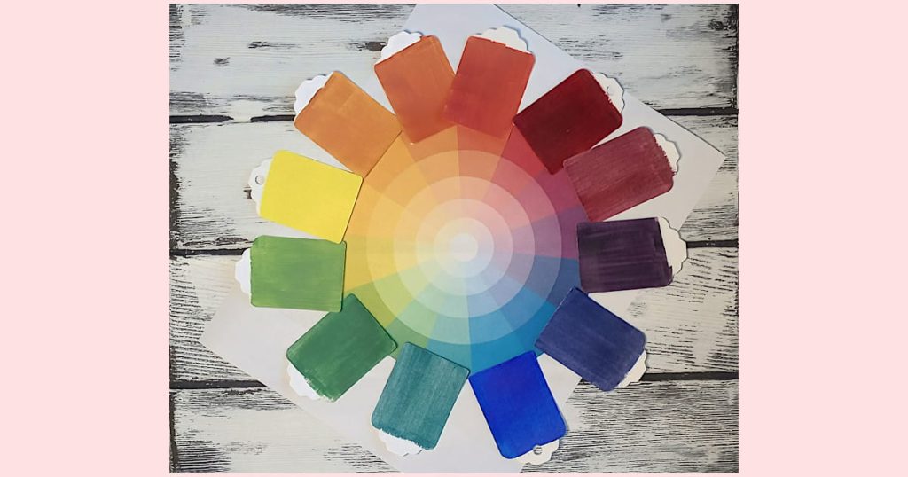
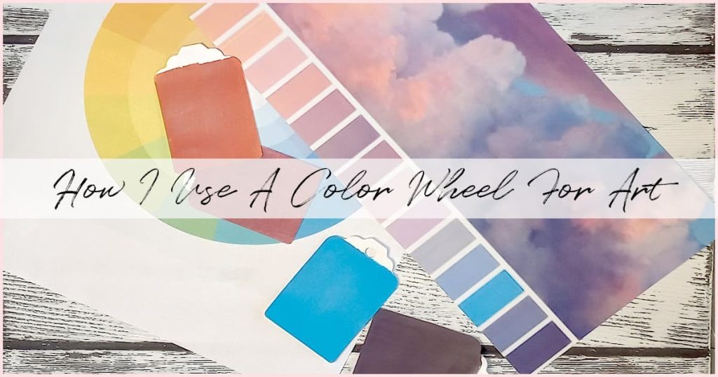
A color wheel is a circle that shows how colors relate to each other. And, as an artist, it can help you to mix and match colors in a way that makes sense.
When I’m painting, I keep a color wheel close by. If I’ve got a bright color like Phthalo Green on my palette and I want to tone it down a bit for something like a forest background, I look across the wheel to find its opposite, which is red. Mixing a little red into that green will dull it just enough without turning it into mud.
That’s the real power of the color wheel. It helps you see color relationships at a glance and make smarter choices, fast. You don’t have to memorize color theory. The wheel does that work for you. If you don’t already have a color wheel, grab this free printable color wheel to follow along. It’s a great tool to help you see how different colors relate to each other.
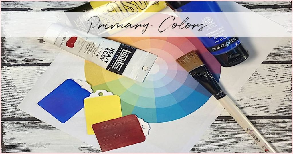
Primary, Secondary, and Tertiary Colors
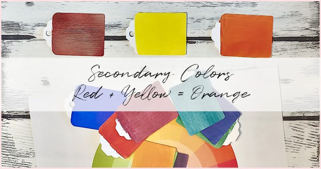
The color wheel is made up of three types of colors: primary, secondary, and tertiary.
Primary colors, red, blue, and yellow, are the building blocks. You can’t make these colors by mixing anything else.
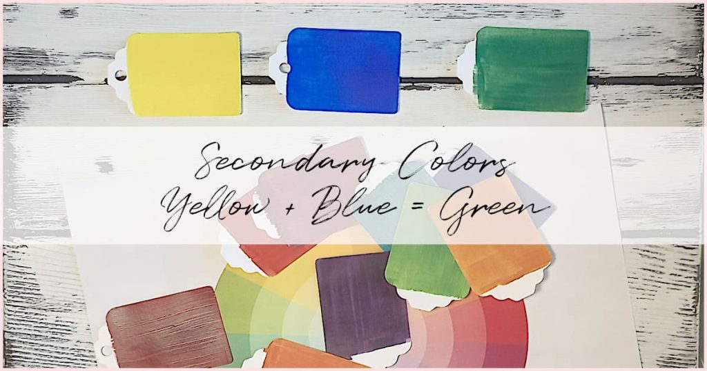
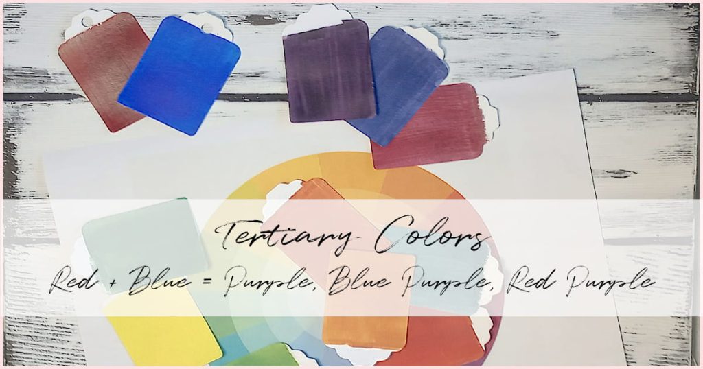
When you mix two primary colors together, you get a secondary color. So red and blue make purple, blue and yellow make green, and yellow and red make orange.
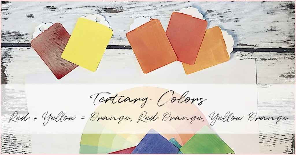
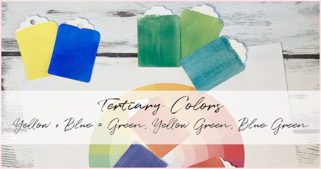
Tertiary colors come next. They’re made when you mix a primary color with a neighboring secondary color. For example, yellow mixed with green gives you lime green. Blue mixed with green makes turquoise or teal.
The best part? If you understand how these colors are made, you don’t need to own every single tube of paint. You can mix a huge range of colors just from a few basics, saving you money and space. Woohoo!
Secondary Colors

Tertiary Colors
Warm vs Cool Colors (And Why It Matters)
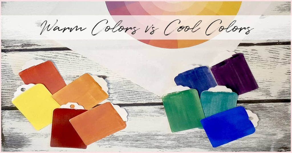
Colors are often described as warm or cool. Warm colors include reds, oranges, and yellows. Cool colors include blues, greens, and purples.
This matters more than you might think. Warm colors can make a painting feel cozy, cheerful, or energetic. Cool colors can make it feel calm, quiet, or even a little mysterious.
Each color also has a “lean.” For example, green can lean more toward yellow (which makes it warmer) or more toward blue (which makes it cooler). This is important when you’re mixing paint, especially for things like shadows or light effects. Understanding warm vs cool can help you avoid dull or lifeless mixes.
Color Harmony: How to Pick Colors That Look Good Together
Color harmony is about choosing colors that go well together and the color wheel makes this super easy.
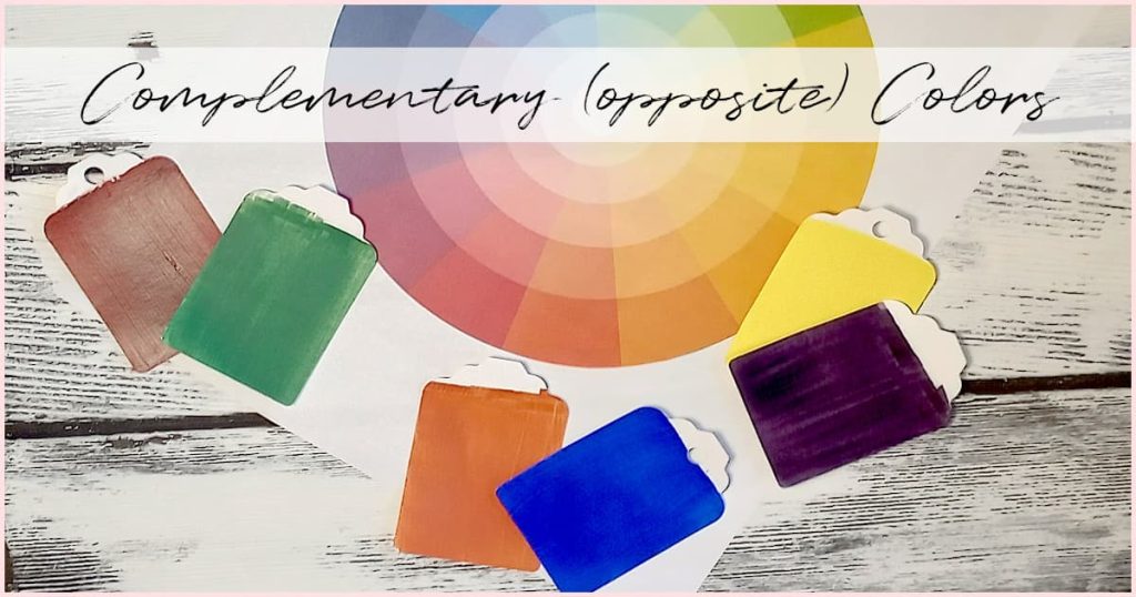
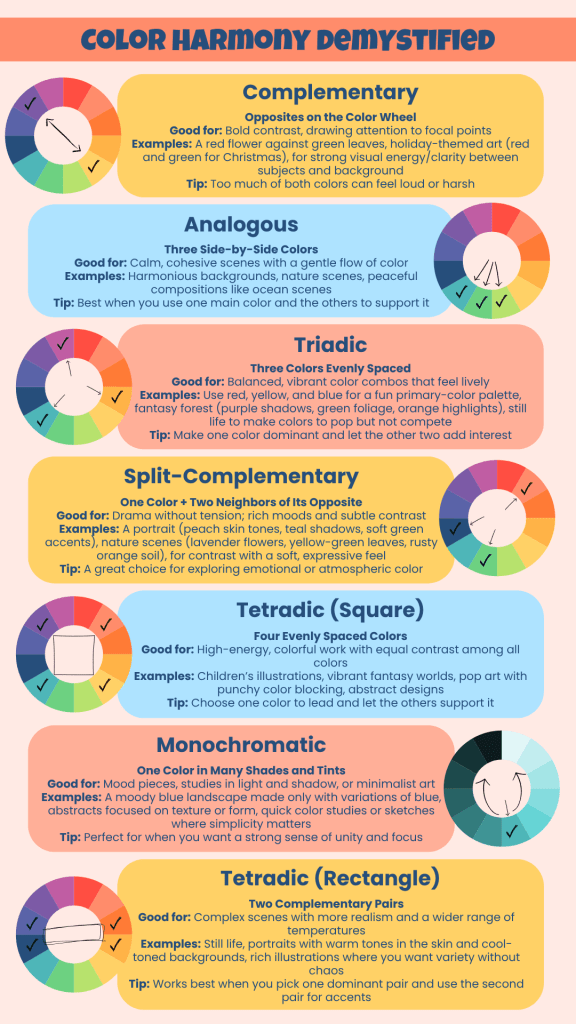
One popular way to do this is with complementary colors. These are colors that sit directly across from each other on the wheel (like red and green or blue and orange). When placed next to each other, these colors really pop. But if you mix them together, you’ll get brown or gray. That can be useful, but only if you mean to do it.
Another way to find harmony is with analogous colors. These are colors that sit next to each other on the wheel, like blue, teal, and green. They blend beautifully and create a calming effect. I often use these in ocean scenes or peaceful landscapes.
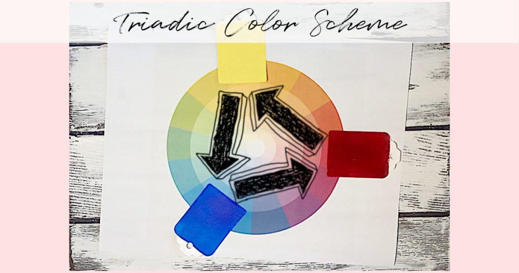
There are other combinations too, like triadic (three colors evenly spaced on the wheel) or split-complementary, but for beginners, complementary and analogous are a great place to start. Just be careful not to overuse harmonious colors, or your painting might feel a little flat. Add a bit of contrast to keep things interesting.

Using a Color Wheel For Art to Mix Acrylic Paint Colors
Mixing paint can feel a little confusing when you’re first starting out, but a color wheel really helps take the mystery out of it. Before you even dip your brush, you can use the wheel to guess how two colors will behave when you mix them.
Start by finding the two colors you want to mix. If they sit next to each other on the wheel—like blue and green—you’ll get a smooth blend that looks natural and soft. But if they’re across from each other, like blue and orange, they’re called complementary colors. That means when you mix them, they’ll cancel each other out a bit, creating browns, grays, or muted colors instead of bright new ones. If you don’t mix complementaries, but you paint them side-by-side, you’ll get lots of pop and drama!
Here’s an example. Let’s say you’re painting an ocean scene and you want to create distance by making the water along the horizon dark and hazy. The problem is you only have a bright blue! But, here’s the fix – If you look across the color wheel, you’ll find orange sitting opposite blue. By adding just a tiny bit of orange, you can tone down that blue and make it feel more deep and distant. The trick is to go slow, adding too much of the opposite color can make the mix look muddy.
You can also use the color wheel to remind yourself how primary colors work together. Mixing red and blue gives you purple. Yellow and red make orange. And yellow and blue make green. The results will depend a bit on which versions of each color you’re using, but it’s a good place to start.
If you want to lighten a color, go ahead and add white. Just keep in mind that white can also cool down the color a little. To darken a color, try reaching for its opposite instead of black. For example, adding a small bit of purple to yellow can darken it without making it look flat.
I always keep a color wheel nearby when I paint. In the beginning, I used it mostly to figure out fun color schemes, like complementary or triadic combos. But over time, it became even more helpful in other ways. Now, I use it to compare the value of two different paint mixes or to decide which red will best match the blue I’m using. It’s not just about color theory, it’s about having a visual tool that helps you make quicker, more confident decisions while you paint.
Choosing a Color Palette for Your Painting

Picking a color palette doesn’t have to be overwhelming. Start with your subject or the mood you want to create. Is it peaceful? Bold? Dreamy?
Then look at your color wheel. Try using a simple combination like complementary or analogous colors. You can also try split-complementary or monochromatic palettes if you’re feeling adventurous.
I always suggest starting with a limited palette. It helps you get comfortable with mixing and stops things from getting too busy or muddy. Once you get used to it, you’ll be able to build a palette that feels just right for each painting.
Tips for Using a Color Wheel For Art
If you’re new to painting, get a physical color wheel or use a digital one. Keep it handy while you paint.
Don’t treat it like a rulebook. It’s just a guide. Combine what the wheel tells you with what you see and feel in your painting.
Think about value (light vs dark) and saturation (bright vs dull), not just hue (the color itself). This can take your color choices to the next level.
One thing that really helped me was keeping a binder full of color mixes I’ve tried. It’s amazing how many different results you can get from just two or three tubes of paint. My personal favorites to experiment with are Quinacridone Magenta and Indian Yellow. Together, they make the most incredible fiery sunsets. You can check out that color combo in my article where I show you how to paint an easy tulip.
Common Beginner Mistakes (and How to Fix Them)
Everybody makes mistakes when learning color mixing. I sure did!
One of the biggest is making mud by mixing complementary colors without realizing it. Another is mixing cool and warm colors without thinking about how they’ll interact. And sometimes we just use way too many colors in one painting, hoping it’ll somehow work out.
The fix? Keep it simple. Plan your colors ahead of time. Use test swatches. And let the color wheel guide you.
If your mix looks dull, check if you accidentally mixed complementary colors or if your paints have opposite undertones. If it’s too bright, tone it down with a tiny bit of the opposite color.
It’s all part of the learning process.

What About Black and White Paint?
Ah, black and white…the two “colors” that bring out strong opinions in the art world.
Technically, black absorbs all colors and white reflects them all. But when you’re painting, things get less scientific and more personal.
You can use black to darken a color and white to lighten it. Just be aware that both will change the color’s personality. For example, Mars Black and Cadmium Yellow often make a weird green when mixed. Not always what you’re going for!
Even black and white paints can lean warm or cool, and that affects your mixes. So, think of them as their own paints, not just something you throw in to change the value.

Common Questions About Using a Color Wheel in Art
Do I need a color wheel to start painting?
Nope! You just need paint, brushes, and something to paint on. But a color wheel helps you learn faster and avoid mixing mistakes.
What is the best color wheel for beginners?
Any color wheel will work, but look for one that includes tints and shades, plus reminders of color relationships like complementary and analogous.
Can I use a color wheel to mix skin tones?
Yes. Most complementary mixes create some kind of brown, so you can tweak those to build natural-looking skin tones.
What if I only have a few paint colors at home?
No problem. Use the color wheel to figure out what colors you can make with what you have. A limited palette is a great way to learn.
Why don’t my mixed colors look like the ones on the wheel?
Paints have undertones. Even if two paints look the same, they may behave differently when mixed. To top it off, a paint with the same name, but from two different companies, can look very different (Payne’s Gray is a big one, that comes to mind). That’s why experimenting is key.
Can I use the wheel to create a mood in my painting?
Yes! Use warm colors for energy or cool colors for calm. Choose your palette based on how you want your painting to feel.
Why do my mixed colors look muddy?
You’re probably mixing complementary colors or combining warm and cool paints without realizing it. It could also be as simple as your rinse water is dirty, which can make light colors, like white, lose their vibrancy.
How do professionals use a color wheel differently?
They usually don’t need it every time, but most started by using it regularly. Over time, they’ve memorized what works and what doesn’t.
Final Thoughts: Start Using the Color Wheel with Confidence
Using a color wheel for art won’t make your painting perfect—but it will make it easier. The more you use it, the more it becomes second nature.
I keep mine right next to my paint supplies and refer to it often, especially when I’m stuck or trying to figure out how to mix a certain shade. It’s saved me a lot of time and money over the years.
Some people say you don’t really need a color wheel, and maybe that’s true for them. But for beginners, or anyone who just wants painting to feel a little less intimidating, it’s a smart tool to keep close by.
Give it a try in your next painting. You might be surprised at how much it helps.