Meet the Author

Artist | Owner of Squishing Paint | Educator - Sara brings over 40 years of creative experience, a decade of specializing in acrylic painting, and a passion for guiding new artists as they embark on their own artistic journeys


Hey there, painting pals! Have you ever wondered how to make a color palette from a photo for your next acrylic painting project? Have you ever found yourself gazing at a stunning painting, wondering how the artist managed to capture those mesmerizing colors so perfectly? Well, today, we’re diving headfirst into the colorful world of acrylic paint, and I’m here to guide you through the magical process of creating your very own captivating color palette.
In this beginner-friendly journey, we’ll embark on the art of translating a reference photo into a symphony of hues that will bring your acrylic masterpiece to life. From picking the perfect photo to matching colors like a pro, I’ve got you covered. So, grab your brushes, dust off that palette, and let’s turn your artistic vision into a reality!

Selecting A Reference Photo
Your reference photo is not just a picture; it’s your artistic partner in crime. Lighting, clarity, mood, and more will make a huge difference between a mesmerizing acrylic painting and a “meh” painting.
Choose A High-Quality Reference Photo
Selecting the right reference photo is like laying the foundation for your painting adventure. Aim for photos with clear details, sharp contrasts, and vibrant colors. Don’t be afraid to experiment with different angles and perspectives until you find the one that resonates with your creative instincts. High-resolution images will be your best friend, so you can capture every nuance with clarity.
Ensure Good Lighting And Clarity In The Photo
Lighting can make or break your painting’s color accuracy. Opt for photos taken in natural light to reveal the true colors and avoid harsh shadows that might mislead your artistic choices.
- Taking photos outside with no direct sunlight is best. In fact, I’ve had the most success when I’ve done photo shoots outside on days when it’s slightly overcast. You want the light to be diffused but not dark if that makes sense.
- If you need to take photos inside, say for a still life, make sure to set up near a window with indirect sunlight. You want to minimize shadows without the whites getting overblown.
- If the lighting in your reference photo is a bit wonky, consider adjusting it digitally or using filters to enhance clarity. A well-lit photo is like a secret code that unlocks the full potential of your acrylic palette.
Consider The Overall Mood Of The Image
Now, let’s tap into the emotional vibe of your painting-to-be. Is it a serene landscape, a lively cityscape, or perhaps a cozy still life? Understanding the mood of your reference photo is crucial for setting the tone of your artwork. Take a moment to connect with the emotions it evokes; this will guide you in choosing colors that not only match but also enhance the desired ambiance of your painting.
If you want to create a painting that evokes a certain feeling, you may be interested in reading my article about creating mood through color.
Analyzing The Reference Photo
Scrutinizing your reference photo is like having a conversation with it—listen to what it’s saying, and showing. What are the dominant colors? What does the light and shadow tell you about the image? Which of the colors are warm and which are cool? Is there more warmth or is it mostly cool? How does the reference photo make you feel?
Identifying Dominant Colors In The Photo
Alright, let’s put on our detective hats and dive into the world of colors! Look closely at your reference photo and identify the hues that grab your attention first. These are your dominant colors—the MVPs of your palette. Are they warm and inviting, or cool and calming? Understanding these main players will set the stage for your entire painting.
Noting Variations In Light And Shadow
Now, let’s talk about the yin and yang of painting—light and shadow. Notice how the light dances across your reference photo, creating areas of brightness and shadow. These variations give your painting depth and dimension. As a beginner, don’t stress about capturing every nuance; just observe where the light hits and where it retreats into the shadows. Try to imagine where your light source is coming from.
Paying Attention To Color Temperature (Warm Vs. Cool Colors)
Time to explore the temperature of colors, and no, we’re not talking about a weather report! Warm colors (reds, oranges, yellows) bring coziness, while cool colors (blues, greens, purples) evoke a sense of calm. Take note of the temperature interplay in your reference photo. Is there a warm sunset glow or a cool moonlit vibe? Understanding this dynamic will help you orchestrate a symphony of colors that harmonize beautifully.
Color Mixing Recipes:
- How To Make Navy Blue Acrylic Paint
- Turquoise Acrylic Paint Mix Recipes
- Make Your Own Green Acrylic Paint
How To Make A Color Palette From A Photo
To make things super easy, there is this really cool website that allows you to upload a photo and make a color palette from it. How awesome is that?!
Coolors is an online tool designed to help artists and designers create color schemes for various projects. The website features a large button that says “Start the Generator.” If you click on it, Coolors will generate a random color palette for you.
If you like a specific color in the generated palette, you can lock it in place so that the generator only changes the unlocked colors. You can manually adjust individual colors by using the sliders for hue, saturation, and brightness and there are also options to input specific color values (hex codes)or choose from different color models.
In addition, Coolors provides options to explore popular color palettes and trending colors and you can also save and organize your favorite palettes for future reference if you have a free account. Once you’ve created a color scheme you like, you can export it. This makes it easy to use the colors in your design projects. Coolors also provides sharing options, allowing you to share your color palettes with others.
While you can use Coolors without an account, creating one allows you to save your color palettes for future use. That said, you can only save palettes with five colors. Any more than that, you’ll have to pay for the pro version.
Having this awesome tool at your disposal will make color selection so much easier for you so let me show you how to make a color palette from a photo with a quick step-by-step.
Step One:
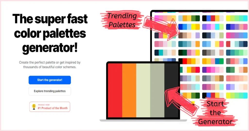
Go to the Coolors website. If you just want to check out pre-existing palette color templates, you can play around with the generator and the trending palettes. However, we’re going to be focusing on how to make a color palette from a photo and that involves a few more steps.
Step Two:

Click on “Tools” and select depending on what you want to do. In this case, I’m going to show you how to make a color palette from a photo so I’ll click on “Image Picker”.
Step Three:
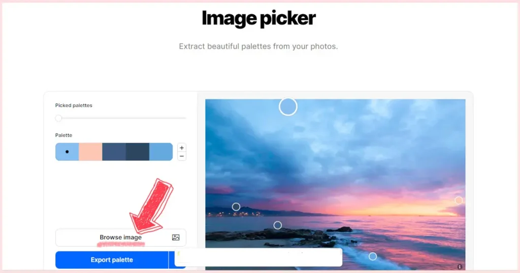
Next, click “Browse Image”, click on the little image icon/browse or drop image, find the image on your device, and open it.
Step Four:
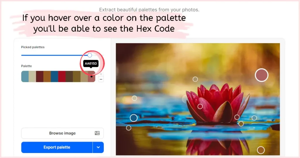
You’ll now be on the Palette Maker page where you’ll see the uploaded image, a slider for “Picked Palettes”, and a sample color scheme from the image with + and – buttons next to it.
Step Five:
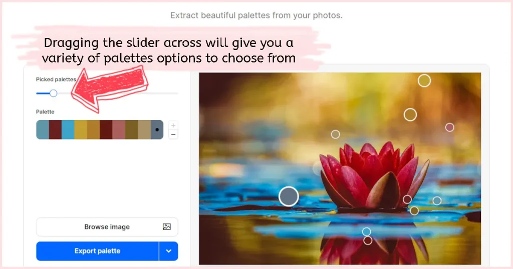
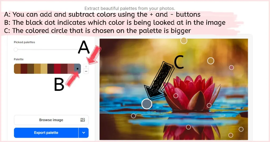
This is where you can get creative! Use the “Picked Palettes” option, and continue to move the slider across to give you 40 different palette templates to choose from.
Next, use the plus sign button next to the colorful basic palette to add additional colors. You can have ten colors in total.
You can also click and drag the colored circles that are covering parts of your photo to switch up the colors that were pre-chosen for you. This will make your palette even more custom.
Step Six:

Once you’re happy with the colors you’ve chosen, click on the down arrow on the blue “Export Palette” button.
Here, you’ll have many options but we’re going to focus on saving your palette creation and creating a collage.
To save your palette (you can only save a palette with five colors if using the free version) click on “Save Palette”, ill out as much or as little info as you want, and finish by clicking the blue “save” button.
If you’d like to create a collage that has both your photo and the color palette you customized, click on “Create Collage” to take you to the Collage Maker page.
Step Seven:
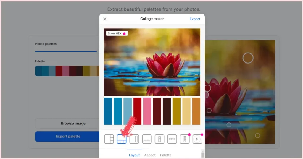
At the bottom of this screen, you’ll see three options – Layout, Aspect, and Palette.
Layout is where you can choose where you want your colors to be located. I like using the colors along the bottom and underneath the image.
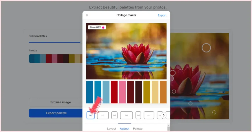
Next, we’ve got the “Aspect” tab. This is where you can choose how you want your whole collage to look on paper, on a website, etc. I like using the 1×1 option.

Lastly, the “Palette” option allows you to add more colors but I prefer having the option of choosing additional colors on the Palette Maker page. That way, you can click and drag the color circles around your image to get the exact colors you want. This option doesn’t allow you to customize.
Step Eight:
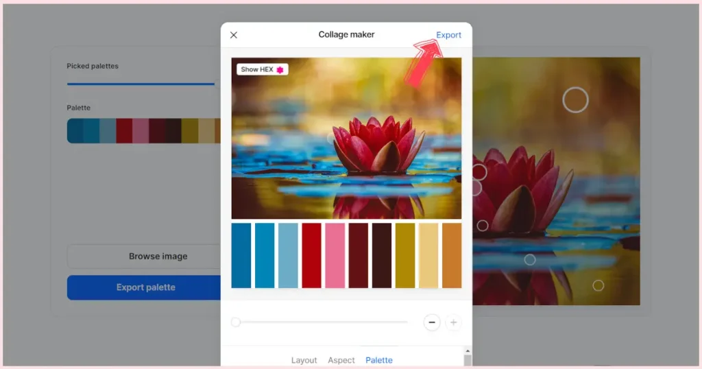
Once you’re completely happy with your color palette collage, go ahead and click “Export”. This will download your color palette to your device and you’ll find it in your downloads folder with a name that’ll be something like “collage…”. It will most likely be downloaded as a jpg.
Step Nine:

Lastly, make sure to print your color collage if you have that option. You’ll still find it helpful if you can’t print it but I like having a paper copy so I can punch holes in the colors. It’s super helpful when you are trying to match up paint colors and mixes.
More Color Mixing Recipes:
Tips For Making A Color Palette From Your Photo
- Choose a limited number of base colors – Alright, brave artists, let’s start by keeping it simple. When first learning how to make a color palette from a photo, you’ll want to choose a handful of base colors that align with the dominant hues you identified in your reference photo. Think of these as the main characters in your painting—they set the stage for the whole masterpiece. If your reference photo is rocking a beautiful blue sky, grab some blues and maybe a touch of white for that heavenly canvas. Luckily, Coolors makes this super simple since you can choose up to ten colors.
- Considering tonal values for a balanced composition – Now, let’s talk about the unsung hero of painting—tonal values. These are the shades ranging from light to dark that give your artwork depth. Squint your eyes and look at your reference photo; notice the areas of light and shadow. Use this insight to adjust the tonal values in your basic palette. Lighten up for those sunny spots, and deepen the colors for shadows. Balancing these values is like adding the secret sauce that makes your painting pop. You can also do this by making a copy of your reference photo in grayscale. This removes the distraction of the pretty colors and allows you to more easily see the different tones.
- Create a window in your paint chips – I find it very useful to punch a hole in each of the color chips on your color palette collage. You can use this little window to check your paint colors and mixes. Just place the window over your dried paint mixture and see how close you are to the original color. Adjust if you feel the need but it’s not necessary. “Close enough” is where you want to be.
Testing And Adjusting Your Acrylic Paint Colors
Remember, the journey of a painting is a series of adjustments and tweaks. Don’t be afraid to experiment, make mistakes, and fine-tune until you’re satisfied. Your color palette is like a puzzle, and each adjustment is a piece that brings you closer to the complete picture.
Matching Paint Colors To The Newly Created Color Palette
Matching colors is like creating a beautiful melody; when it’s in tune, it’s pure magic. But, listen, this is going to require you to trust your instinct a bit. There will always be a bit of a difference between your color palette and the paint mixtures you come up with. Don’t sweat it! Think of the color palette you’ve created as the first edition that needs to be edited. Go in with no expectations and leave perfectionism at the door. Give yourself permission to play and experiment.
Take your time making paint chips of the colors you think will be useful straight from the tube. Let them dry and then compare them to the colors in your color palette collage. If you’ve punched holes in each of the color chips on your collage, this will be a quick process. Having the paint color surrounded by the color palette collage chip will make it super easy to see if it’s a match or at least close enough.
If your paint color doesn’t match, try to figure out what’s missing. Is it more vibrant than the color chip? Add a contrasting color. Is it cooler than the color chip? Look for a warmer hue or mix one up. You get the idea. Once you’ve found a color or mix that’s close enough, jot down a note about how you created it and keep it close by for future mixing.
Adjusting Colors To Fit The Desired Mood And Style
Your painting, your rules! Now that you’ve got your base colors, experiment with adjusting them to match the mood and style you’re aiming for. Want a dreamy, romantic feel? Maybe add a touch of pink or soften the blues. Craving bold and vibrant? Amp up those reds and yellows.
The point is to use your own creativity and preference to make the reference photo your own. If you like warm colors but the image is mostly cool, switch out some of those cool colors and turn up the heat. Your palette is your artistic playground, so play with intensity, saturation, and balance until your colors align with the emotions you want to convey.
Just because you’ve used a website to learn how to make a color palette from a photo doesn’t mean you have to stick with it. You can change it up however you like. Never look at differences between your finished painting and the reference photo as failure. Think of it as adding your own creative touch. Bob Ross saying “happy little accidents” comes to mind and should be everyone’s mantra.
Ensuring Harmony And Coherence In The Color Scheme
Harmony is the name of the game, and your palette is the orchestra. Are the colors working together like a well-rehearsed symphony, or is there a rogue note throwing off the vibe? Ensure there’s a balance between warm and cool tones, light and dark values, and vivid and muted colors. This cohesion will give your painting a polished look, making your colors dance together rather than stepping on each other’s toes.
Creating Color Swatches On A Separate Surface
Personally, I like to make small paint chip cards on cardstock and, on the back, make notes of the paint color/mix, brand of paint(s), exact recipe of the mix, whether the color/mix is transparent, etc. I find it easier to move the paint chip cards around and see how the different colors/mixes interact with each other without wasting a bunch of paint. Plus, once you’ve made the paint chips, you can save them for future projects. Think of it as the beginning of your very own custom color wheel.
Even More Paint Mix Recipes:
- Purple Acrylic Paint Recipes
- Making Magenta Acrylic Paint Mixes
- What Happens When You Mix Purple and Green Acrylic Paint
Closing Thoughts On Creating A Custom Color Palette From An Image
Bravo, painting pal, you’ve just navigated how to create a color palette from a photo like a pro! From choosing the perfect reference photo to learning how to use an online tool to fine-tuning your palette, you can now handle making a convincing color palette that will resemble your reference photo and you won’t even break a sweat! As long as you remember, your reference photo is your compass, guiding you through the world of colors but it’s never set in stone, you’ll be just fine. Identify dominant hues, play with light and shadow, and let the magic unfold.
Now, here’s a little secret about becoming a maestro of acrylics—it’s all about practice and experimentation. Your first painting might not be a masterpiece, and that’s perfectly okay! Each stroke, mix, and adjustment is a step forward on your artistic journey. Embrace the process, be open to trying new techniques, and let the unexpected moments become the gems in your creative treasure trove.