Meet the Author

Artist | Owner of Squishing Paint | Educator - Sara brings over 40 years of creative experience, a decade of specializing in acrylic painting, and a passion for guiding new artists as they embark on their own artistic journeys


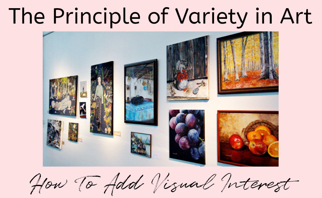
In this post, we’ll talk about the principle of variety, why you should use it, and how to use it in your paintings.
Before I started paying attention to variety in my paintings, I always felt like something was … off. Everything began to change in my art journey once I paid attention to it.
Simply put, the principle of variety in art is any contrast between color, shape, brush strokes, lines, and/or size that you add to the composition of your painting. It’s what stops your art from being boring and helps to keep the viewer engaged.
Let’s take a closer look at adding variety and how to incorporate it into our art without going overboard.
Benefit Of Using Principle Of Variety In Art
Visual diversity is, in my opinion, what makes a painting go from good to phenomenal!
When you’ve decided what you want your focal point to be, you use a variety of shapes, sizes, and/or colors to help draw attention to it in a visually appealing way.
For example, let’s say you had a softly blended background in different tones of the same color. Maybe, you decided to paint the foreground in a shade just a little bit deeper than the darkest tone on the background.
At this point, your painting would look great if you were going for a very peaceful vibe, but there’s not much variety. This creates a situation where the viewer’s eye will travel around the canvas instead of focusing on one particular object.
On the other hand, what if you decided to add a subject in a complimentary color to the background? Voila, you’ve just created variety! No matter where on the canvas the subject is placed, the eye will be drawn to it.
You can see how this is a huge benefit. It allows you to dictate the most important thing in your painting.
As another example, you could have a solid colored background with a bunch of butterflies painted in different sizes, giving you variety. However, if you paint all the butterflies in the same colors except for one, that’s what the eye will be drawn to, no matter what size the butterfly is.
Using the principle of variety through color gives you the control to create an unmistakable focal point. This is why I enjoy painting in monochrome and adding just one more color to make it pop. I deliberately decide which element in the painting will receive the pop of color depending on what I want the focal point to be. Make sense?
Different Ways To Add Variety To Paintings
Between shape, color, and size, there isn’t one that works better than the other to create interest in your paintings. As an artist, you may find one method easier to visualize.
Remember, though, that you can use all three in one of your art pieces. However, that does come with a downside which we’ll get into a little later.
Shape
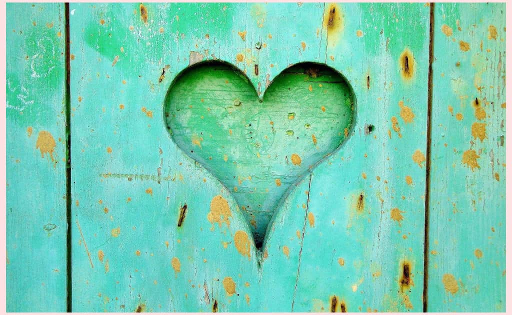
The rounded curves of the heart along with the spaces between the boards helps to create visual interest through shape.
When discussing using shape to add diversity to your paintings, this has to do with the forms used and their placement in relation to each other.
For example, If you decided to paint a modern minimalist painting of squares, where all of the shapes were exactly the same, you would not be using shape to create interest. But let’s say you decide to add some circles to break things up. Now, you’ve got yourself some variety happening!
Color

Even though this images is filled with the same shape, the different colors are what make it interesting to look at.
Color is probably one of the more obvious ways to make things interesting. Using color to add spice to a painting can be accomplished in three ways. You can use the vibrancy (which is how saturated a color is), the contrast between light and dark (AKA: value), or the hue (where the colors are located on the color wheel in comparison to one another).
I think using hue is probably the easiest way to add visual appeal. And depending on what “feel” you’re trying to convey, you’ll want to know the difference between harmonious and complementary colors.
Harmonious colors hang out next to each other on the color wheel, whereas complementary colors are directly opposite one another.
A simple method to use color to create variety is to think about what colors you want to use for your main subject. Then, use a complementary or harmonious color for most of the background.
If you use a harmonious color, you’ll add a feeling of tranquility to your painting. On the other hand, if you use a complementary color, it will really make your focal point stand out. It’s a great way to add instant POW! to a painting.
Quick Tip:
An easy way to remember it is to think about colors as kids on a playground. Harmonious colors are BFFs and are always together. They’re so much alike; they’re like twinsies! Complimentary colors are the kids who are very different from each other but can really make each other shine under the right circumstances.
Size

Even something as simple as a narrowing road can add visual diversity through size.
Using different sizes in your paintings helps to tell the story of your focal point. Size, as well as color, is a great way to talk about perspective.
If you were to paint a still life with a bowl full of grapes and a few lemons on the table next to the bowl, where each grape is the same size as the lemons, it would look totally off.
The same could be said if you were to paint distant trees that were the same size as the trees in the foreground. Without smaller trees in the far distance, you’d lose the sense of depth.
Another example would be a river. If you painted a river with the same thickness in the distance as in the foreground, it would look like your river was going up into the sky instead of fading into the distance.
Lines
Lines are a great way to show variety in your art work
Think about all of the lines that can be used in a painting. You’ve got horizon lines, vertical tree trunks of different thicknesses, the soft curves of a slowly moving river, the continuous line of a seashore as opposed to the broken lines of individual waves, and on and on.
Variety can be achieved with lines in the following ways:
- Thin and thick
- Horizontal and vertical
- Straight and curved
- Short and long
- Broken and continuous
Brush Strokes/Techniques
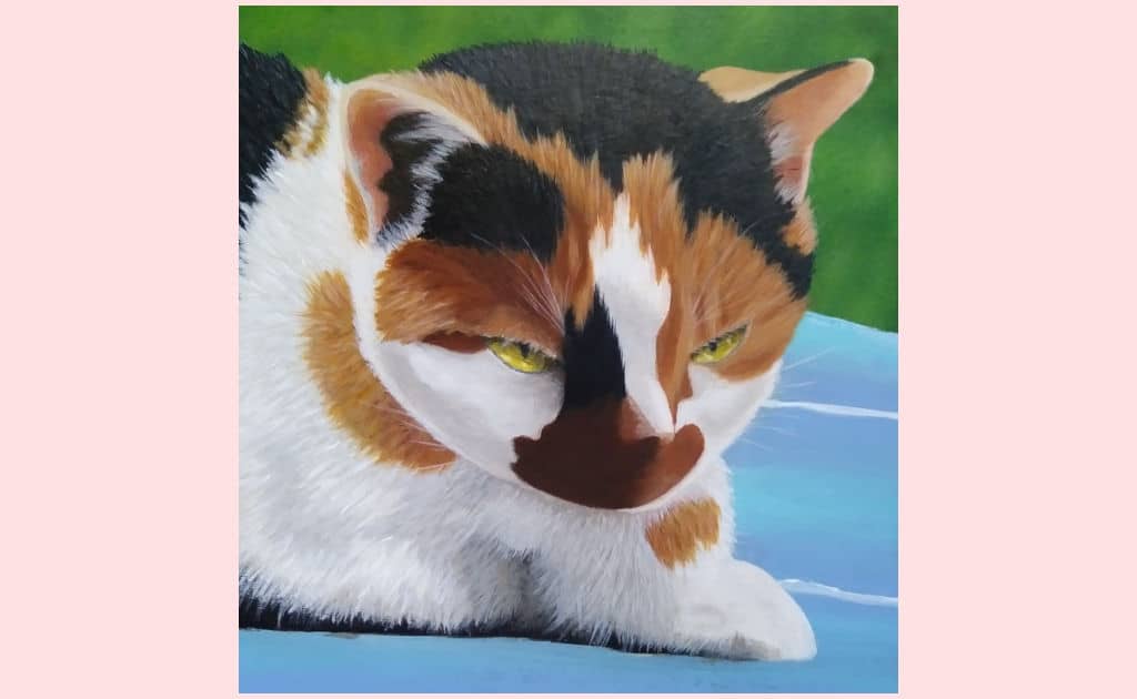
When creating this painting, I deliberately made the background blurry while focusing a ton of detail into the fur and eyes. This is how I used brush strokes/techniques to guide the viewers attention to the cat.
Yes, even brush strokes/techniques are included in the principle of variety. They are one of my favorite ways to keep things interesting.
As seen in the image above, I enjoy playing with softly blurred backgrounds while making the main subject very detailed, with lots of brush strokes and different brush techniques.
This is also where using a palette knife and different thicknesses of paint comes into play.
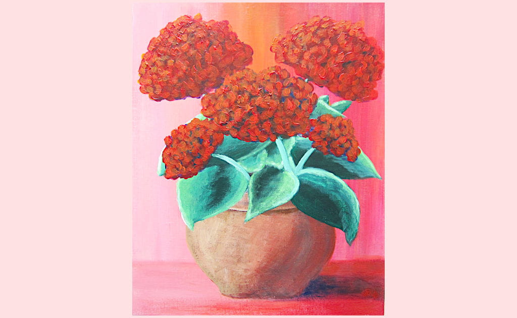
I used technique to create visual interest here.
In my painting, “A Pot Full”, I used long brush strokes to blend the wall in the background and the surface that the pot is sitting on.
For the blooms, I’ve used a palette knife with thick paint, and for the leaves, flower pot, and shadow, I’ve used a lot of dry brushing,
As you can see, using a variety of brush strokes can create not only texture but also visual diversity.
The Downside To Adding Too Much Variety
Is there such thing as overdoing the principle of variety in your paintings? Oh, yes, and it’s called chaos.
When you are too focused on adding interesting elements to your paintings, you run the risk of creating utter chaos.
Now, if that’s the feeling you’re going for, great! But you’ve got to be very deliberate about it, and that can be harder than it sounds.
On the other hand, if you intend to create a landscape and start throwing variety around willy-nilly, it can cause anxiety for the viewer.
Adding visual interest is best when you think about what your intentions are with your painting, and you do a bit of planning beforehand, especially if you’re a beginner and just starting to play with creating your own compositions.
Balancing The Principle Of Variety With Harmony And Unity
So, we know that we don’t want too little variety or our paintings will be bo-ring, but we don’t want to add too much and cause the viewer to have a panic attack either. Enter harmony and unity, two other principles of art.
What Is The Principle Of Harmony?
In this image, the colors, shapes and lines are all harmonious. Harmony is what keeps things peaceful but too much and you risk creating a piece that’s dull and feels as though something is missing.
Harmony is the exact opposite of variety. It’s the similarities between different elements in the painting.
This could be through the shapes, colors, lines, brush strokes, size, etc. For example, think of different colors that sit next to each other on the color wheel. These are harmonious colors, they aren’t the exact same but they go very well together. Harmony equals zen, but too much zen can put you to sleep.
Think of harmony and variety as two kids playing tug of war over a toy. In either instance, too much of either, and things will go downhill fast in your painting.
So, how do you stop from having a dull or chaotic composition? Where’s the happy medium? Why can’t we all just get along!
What Is The Principle Of Unity?
Although the principle of unity is very closely related and easily confused with harmony, it is more of an umbrella term. It is the glue that holds all of the different parts of the painting together.
To put it simply, It’s all the puzzle pieces fitting together to create a picture. It is probably one of the most important principles of them all.
How Does Adding Harmony And Unity Help To Balance Variety?
To sum up the principles of variety, harmony, and overall unity, balance is achieved when you can tame the frantic chaos of variety with harmony and the sleepy monotony of harmony with variety which creates unity by bringing all elements of a painting together, so they make sense.
Variety = interest
Harmony = zen
Unity = everything working together to create a well-balanced painting
Final Word
The principle of variety is fundamental to your paintings but not any more essential than adding harmony and unifying the whole piece.
Adding variety keeps things interesting and encourages the viewer to spend some time admiring your art.
The bonus to using visual diversity along with an equal helping of harmony is that you can use both principles together to train the eye to whatever element you feel is the focus of your painting.
Now that you understand the need for variety and how to add it, look at your art and try to pick out all of the ways you’ve used it in your paintings. I bet you’ve been using it a lot more than you realize.
Help out your artist pals by sharing this article so they can learn how to add spice to their paintings through variety!