Meet the Author

Artist | Owner of Squishing Paint | Educator - Sara brings over 40 years of creative experience, a decade of specializing in acrylic painting, and a passion for guiding new artists as they embark on their own artistic journeys


Today, let’s chat about proportion in art and dive deep into the mystery behind one of the essential elements that takes a painting from “nice” to “amazing”. Proportion is like a secret ingredient that artists use to create harmony and balance and we’re totally here for it!
Painting is like storytelling, and just like in a story, the size and placement of objects in a painting can make a big difference. By understanding proportions, you’ll be able to create balanced and visually appealing artworks that will make everyone say, “Wow!”
Proportion is an important principle of art and refers to how different elements in a painting relate to each other in terms of size, shape, and placement. It can be used to create feelings, harmony, and focal points.
In this article, we’re going to explore the different types of proportion, how to easily incorporate them into our own paintings, when it’s not necessary to include, what the Golden Ratio, the Fibonacci Sequence, and the Rule of Thirds are, and everything in between. We’ll even take a look at some famous paintings and see how proportion is used in each example. Let’s do this!
What Is Proportion In Art?
Proportion is like a recipe for creating a visually pleasing and balanced composition. Just like in the “real” world, where we prefer things to be in proportion (for example, a table that’s not too big or too small for the room), we use it in our paintings to help our art make sense to others.
For example, imagine you’re drawing a person. Proportion would help you make sure that the head is not too big or too small compared to the body, that the arms and legs are the right lengths, and that everything looks balanced.
If any part looks too big or too small compared to the rest, it might look…off. Have you ever tried to paint eyes and one is bigger, lower, or shaped differently than the other and the whole thing just looks wonky? Ugh! Eyeballs are haaarrrrd!
Understanding Proportion In Art Can Make A Huge Difference In Your Paintings
Proportion can be a complete game-changer for your art once you understand what it can do for your paintings.
1. Things Will Be More Realistic: Proportion plays a crucial role in creating artwork that looks true to life. When the proportions of objects, figures, or landscapes are painted accurately, your art becomes easier to relate to for most people.
2. Easily Achieve Visual Harmony: When the objects in your painting are properly proportioned, they fit together naturally, creating a sense of calm. It literally tells a visual story.
For example, if you’re painting a forest scene, with a cabin, adding very large trees to the foreground will push the cabin back and make it look distant from the viewer’s perspective (proportions and perspective are like besties in the painting world).
Or, let’s say you want to create a landscape where a mountain is your focal point. Once your painting is done, it seems kind of lopsided because the mountain is very big and on one side of the canvas while the other side is nothing but a forest made up of small trees.
If you were to add a lake to the other side of the canvas that would create more harmony because, visually, the canvas would have interesting aspects across the whole expanse. Keeping the mountain larger than the lake or forest still creates the sense that it is the most important element in the painting.
3. Guide the Viewer’s Eye: Proportion in art can be used strategically to guide the viewer’s eye to the focal point in the painting. By manipulating the sizes and placements of different objects, you can lead the viewer’s gaze to specific areas.
Using the above example of the forest painting, placing small trees behind the cabin creates the illusion that the cabin is closer than the trees and, therefore, gives the viewer the information that the trees are part of the background and aren’t the focal point.
4. Show Intention and Emotion: Proportion is a powerful tool for expressing intention and evoking emotions in art. It’s really as easy as exaggerating or altering the proportions of an element in a painting.
So, if you create a painting where a huge figure is looming over another, the proportion is exaggerated in the looming figure. This not only creates a sense of drama but also evokes a feeling of tension.
Another example would be if you were to paint an exaggerated curvy house that arcs toward the left or the right. Everything else around the house may be accurate and true to life but the exaggerated curve gives the house a whimsical feel which, in turn, makes the overall artwork feel fun.
5. Level Up Your Artistic Style: Proportion in art is an easy way to start experimenting with different art styles. Once you start playing with proportion, either by creating balance or distorting it, you can start to develop your ability to paint things like realism, abstract, expressionism, caricature, etc. (make sure to check out my art styles article for a glimpse into how to find your own style)
6. Improve Your Observation Skills: Incorporating proportion in your paintings requires careful observation of the relationships between different elements. When you pay attention to proportions in your work you exercise that part of your brain that’s in charge of visual detailing.
The more you use this superpower, the easier it will be to understand how objects, figures, and shapes relate to each other in terms of size, shape, and position.
Not only will making proportion a priority help you to make quick artistic decisions but it’s going to boost your confidence in your artwork a gazillion times over!
Key Areas Where Proportion Plays A Significant Role
If you’ve been arting for a while now, you know that there are very few strict rules. Art is mostly about expressing yourself and how you see the world. That said, painting realistically is one area where using proportion in art is an absolute must. If you’ve been dreaming of painting more realistically, here are some things to consider:
1. Scale of Objects: Proportional scale refers to the size relationship between different objects within a painting. Basically, this is how you create perspective, depth, and distance.
2. The Human Form: Proportion is particularly important when painting portraits. It enhances the realism of the subject and, if this is your ultimate goal, pay special attention to the length of limbs, the size of the head, and the placement of facial features.
3. Architecture: When painting buildings or a landscape that includes any type of architectural element, it’s really important to consider the proportions of buildings, structures, and other architectural details. This is especially true with things like columns, windows, and doors. You’re going to want to make sure that they’re in proportion with each other as well as the overall composition of your painting.
4. Composition and Negative Space: Proportion also plays a role in the arrangement of elements within the composition of your painting and, also, the use of negative space.
Basically, you want to use proportions to decide where all of the objects should go and the sizes of each element in relation to each other. This helps to create a feeling of balance.
Imagine if you were painting a still life of a vase of flowers sitting on a table. If you were to make the vase really small in comparison to the table, it wouldn’t look quite right. Or, if you only painted flowers that stayed within the diameter of the vase opening. That would make the whole painting seem cramped with too much negative space.
However, if you painted the same still life with a larger vase filled with flowers that burst from the vase and filled more of the “background” space, you would be creating a beautiful painting that was balanced and harmonious.
Different Types Of Proportion In Art
There are many different types of proportions that painters can use in their artwork, and a lot of them can have different names depending on who you talk to. That said, let’s take a look at a few so you can see where they could fit in your own painting practice.
Hierarchical Proportion
When you decide how big or small something is in comparison to other elements in the painting depending on the level of importance, this is called hierarchical proportion. In this instance, your focal point would be the largest element in the painting.
For example, let’s say the composition of your painting consists of a group of people meeting a famous rock star. In this case, you might consider making the rocker much larger than the other people to show that he/she is the focal point.
Classical Proportion
Classical proportion in art uses mathematical or aesthetic principles to create balanced proportions. Have you ever heard of the Golden Ratio? Yep, that’s what we’re talking about here. Basically, you take math and use it to calculate placement, size, and shape. This is a very strategic way of arranging your composition in the most balanced way possible.
If you’re totally confused, don’t worry, I’ll go over it in more detail a bit later.
Natural/Realistic Proportion
Natural proportion depicts objects, figures, and scenes as they appear in the real world. For example, you would use this type of proportion in art where elements must be shown as true to life as possible. This could include things like portraiture, and photo-realism.
Distorted Proportion
Distorted proportion involves purposefully altering or distorting the proportions of objects or figures. You can use this type of proportion to exaggerate emotions, draw the eye to certain elements, and more.
You would use this type of proportion for expressionistic paintings, abstracts, caricatures, folk art, etc. So, basically, the “rules” of proportion are sort of thrown out the window and you create your own rules. Sounds like fun, eh?
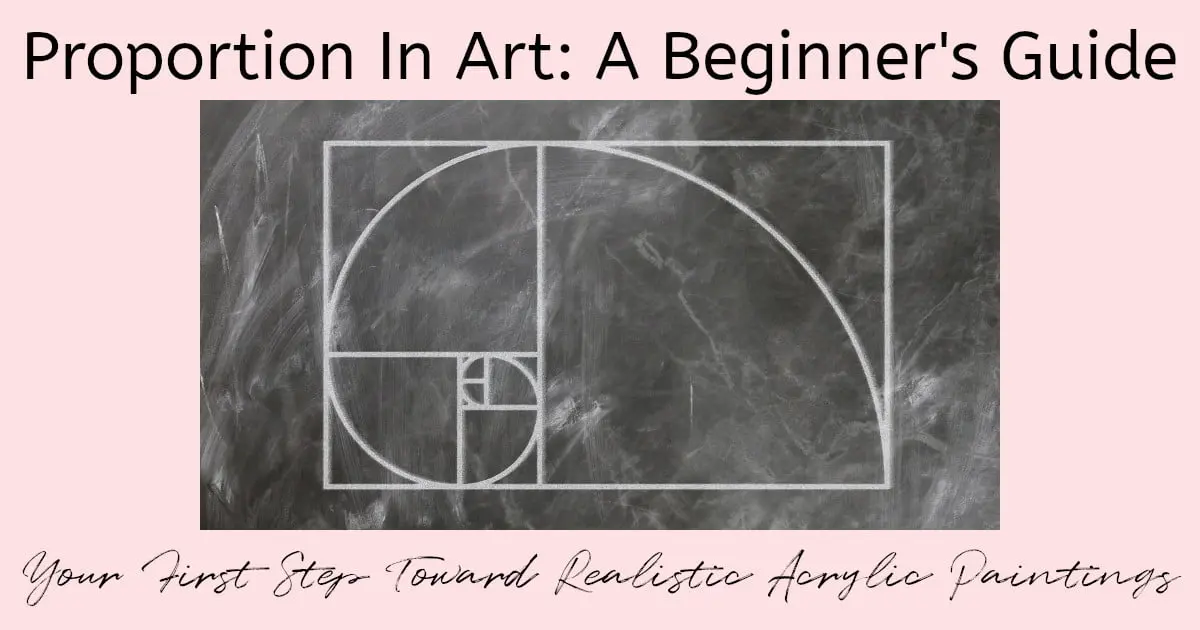
The Golden Ratio
Warning, my painting pals, we’re about to get into some math but it’s actually super cool once you understand it.
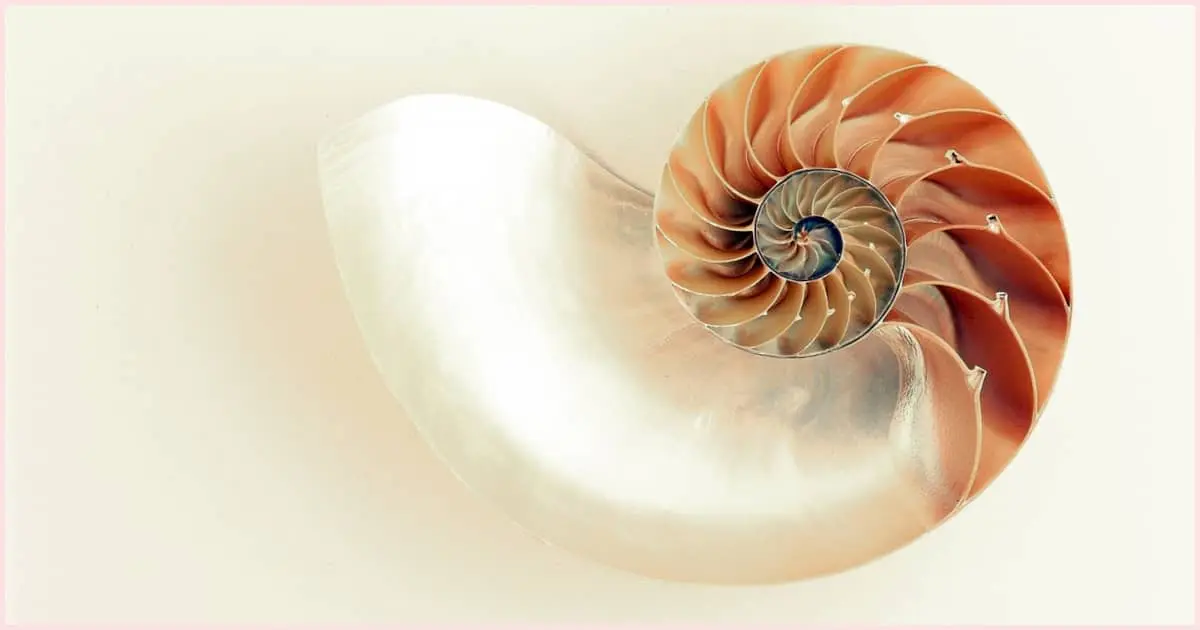
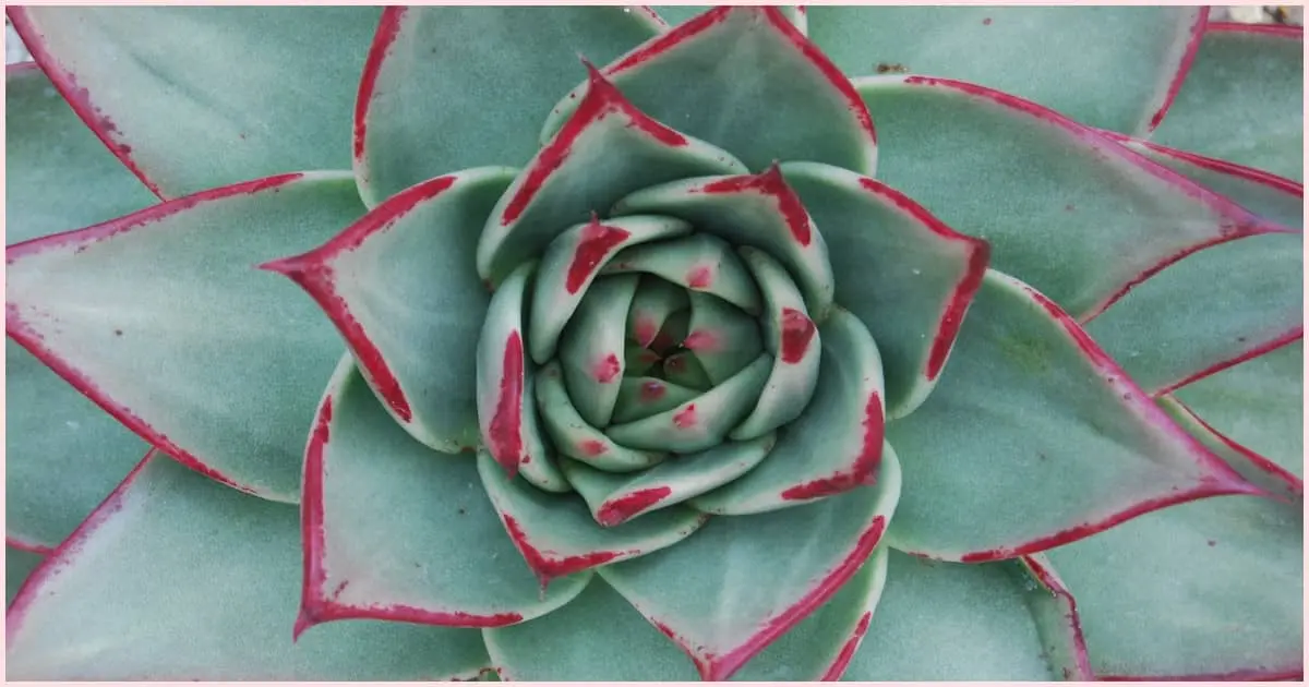
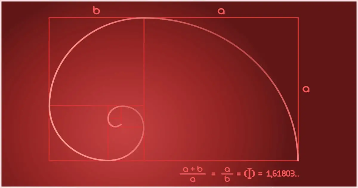
The Golden Ratio is a mathematical ratio that has been used in art forever, pretty much, and for good reason. The actual ratio is 1: 1.618 and you can find it just about everywhere. Not even exaggerating! You can find this measurement in shells, plants, trees, and even the human body!
Have you ever seen a painting or a photo that you are completely drawn to but you can’t figure out why? I mean, it’s a pretty typical composition, and yeah, you like the colors but it’s not that different from the other paintings/photos nearby so why does it call to you so strongly? I bet if you were to measure the placement of the elements within the composition, you’d find that they follow the Golden Ratio of 1:1.618!
It’s kinda freaky but, it’s like there’s some kind of hardwired subconscious thing going on that makes anything created with the Golden Ratio more beautiful to us. It’s like the magical fairy dust of mathematicians!
Artists and mathematicians speculate that it’s been used by Leonardo Da Vinci in “The Last Supper” to figure out the best placement of the table, the prophets, etc.
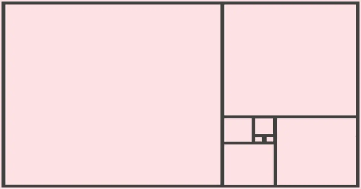
In really basic terms, imagine you multiply the length of your canvas by 0.618 and draw a line to the other side, splitting your canvas into two parts. If you go ahead and measure the different sections, the larger part of the canvas will represent 1.618 while the smaller part will represent 1. This will be true for any rectangle or square canvas.
You can do this along the length and width of your canvas in multiple places and end up with a grid that looks something like tartan plaid. Where these vertical and horizontal lines meet is where you would want to place important elements within the composition, such as the focal point and the horizon line, to name a few.
In addition, the Golden Ratio is closely related to the Fibonacci Sequence.
The Fibonacci Sequence
Have you ever been on social media and seen one of those skill tests where it gives you a bunch of numbers and then asks you to name the next number in the sequence? Any time I’ve tried my hand at one of those skill-testing questions, it’s been patterned after the Fibonacci Sequence.
Basically, the Fibonacci Sequence is where the first number in the sequence added to the second gives you the third number.
Here’s an example: 1, 2, 3, 5, 8, 13, 21, 34, 55, 89, 144, 233, 377, 610, and 987
So, 1 + 2 = 3, 3 + 2 = 5, 3 + 5 = 8, 5 + 8 = 13….and on, and on.
And, the neat thing? This sequence is never-ending. Just like Golden Rectangles, and Golden Spirals, it keeps going and going. But, that’s not all…
If you divide, say, 21 by 13 (the number before it in the sequence), guess what you get? Ding! Ding! Ding! You get 1.6xx!!! Is that not the coolest thing ever? I mean, I’m not going to even pretend to be any good at math but this stuff is the stuff of Da Vinci’s Code…I wonder if this is how that book first became an idea…but, I digress.
So, how would you use this in your own painting practice? Well, let’s imagine that you want to paint a large leaf. The leaf has spikey bits that get closer together as you make your way to the tip of the leaf.
If you were to use the Fibonacci Sequence, you would space the ridges according to the sequence above. So, the first would be 1 part (however large you decide each part will be, one part could equal 1 inch, etc.), the second would be 1 part plus 1 part, the next would be 3 parts, then 5, then 8, then 13, and so on. Visually, this would create the most appealing composition for most people.
To learn more about the Golden Ratio and the Fibonacci Sequence, I highly recommend you take a look at this YouTube video by Andrew Tischler. He explains things in easy to understand terms and also includes examples of paintings as well as where you can find the Golden Ratio in nature. It’s gonna blow your mind!
What About The Rule Of Thirds?
The rule of thirds definitely has its place regarding proportion in art. Basically, this involves dividing your canvas into thirds both horizontally and vertically. From there you would use the places where the lines cross one another to figure out your composition. Placing the most important elements where those lines cross will make a more balanced and visually pleasing piece.
As a beginner, you’ll probably run across this gridding technique quite often because it’s the easiest to understand. I have definitely used it in my own art practice and find that it does help to create harmony.
If you’ve ever painted something and can’t quite figure out why it doesn’t look right, try using a piece of chalk and creating a grid using the rule of thirds. It could just be that you need to adjust your composition a bit.
Scale vs Proportion: What’s The Difference?
A lot of people confuse scale and proportion and although they are closely related, they are slightly different from one another. That said, the two work together to create balance within a painting. It’s a lot to digest so let’s use the example from above of the cabin, forest, and mountain landscape.
So to recap, we’ve got ourselves a landscape painting that shows a vast mountain range with a small cabin nestled in the foreground. We’ve made sure to portray the cabin as significantly smaller compared to the mountains. In this particular scenario, scale refers to the relative size of the objects within the composition.
Because the mountains are much larger and dominate the scene, they are painted on a larger scale. They occupy a substantial portion of the canvas, which gives them an air of grandeur and immensity. On the other hand, the cabin is painted on a smaller scale, making it appear comparatively tiny compared to the mountains. We’ve deliberately adjusted the scale to emphasize the mountains, giving it a feeling of importance.
Scale plays a crucial role in creating visual hierarchy (remember the explanation on hierarchical proportions from earlier?) and depth within a composition. By carefully manipulating the scale of different elements, we can guide the viewer’s eye, establish focal points, and convey a sense of distance or proximity.
In the above landscape painting example, scale refers to the relative size of objects within the composition (mountains to cabin).
Proportion, on the other hand, determines how the elements (mountains, cabin, trees, river, flower field, etc.) within the composition relate to one another in terms of their size, placement, and dimensions. It involves creating a harmonious balance between the different elements.
Let’s go back to the landscape painting example. Proportion would come into play when considering the size relationship between the various elements within the composition. For instance, the size of the cabin compared to the mountains, the placement of trees or other elements in relation to the cabin, and the proportions of different components within the landscape, such as the size of the flowers in the field or the width of the river.
Proportion ensures that the sizes of these elements are visually appealing and balanced within the overall composition. It helps create a sense of harmony and cohesion by ensuring that no individual element overwhelms or appears out of place compared to the others.
To summarize, in the example of the landscape painting, scale is concerned with the relative size of the mountains compared to the cabin, while proportion considers how all the elements within the composition relate to one another in terms of their size, shape, and positioning.
Both scale and proportion play important roles in creating a visually balanced and harmonious composition. They are so closely related that they’re basically a pb & j.
Does Size Determine Proportion?
When looking at proportion in art, you’re not only looking at the size of objects in comparison to one another but you’re also looking at shape and placement.
So, yes, size is important but it’s only one piece of the puzzle. Remember, when you’re figuring out your composition, where you place things is pretty important, as well.
Proportion In Painting Isn’t Always Important
Proportion in art isn’t always that big of a deal. Technically, even painting something that’s out of proportion is still classed as being a type of proportion. Proportion is on a sliding scale, meaning, sometimes it’s really important, and other times it’s only a little bit important.
Let’s look at a few specific examples where proportion isn’t a hard and fast rule:
- Abstract Art – This is the one time where you don’t need to spend a whole lot of time thinking about proportion. Abstract art uses color, shape, and texture to either express a feeling or elicit a feeling. It’s completely intuitive and, therefore, the rules of proportion are up to the artist. Where you place an object, how big it is in relation to the other elements, and what shape it is, is completely up to you! You may want to use color proportion to create balance but the rules regarding proportions are really relaxed when it comes to abstract. I think that’s why it can be very challenging for new artists to create abstract paintings.
- Intentional Artistic Choices – Sometimes, you want to put major emphasis on an element within the composition in your painting so you paint it in a way that’s completely different than everything else. You might also want to experiment with cubism, which is an art style that deals with simple geometric shapes that make up the whole composition. Pablo Picasso went through a period where he was experimenting with cubism. One thing I do purposefully quite often is to make everything but my focal point blurry. You can tell what the other objects are but they’re more of an impression whereas my focal point gets a ton of detail and looks more realistic.
- Conceptual Art – Conceptual art is all about the idea behind the painting and not so much how it’s painted. That means that proportion isn’t always that important and doesn’t need to be taken into consideration. Think of it this way, in conceptual art, the idea is more important than the execution or the finished painting.
How To Easily Decide On Proportions From A Blank Canvas
Understanding how proportion works is great but how do you use all of this knowledge in your own artwork? And, how do you easily create proportion in art from scratch?
Let’s take a quick look at a few different ways that you can begin the process of creating a sense of balance and harmony from the get-go.
Use the Golden Ratio
Once you’ve got your background painted in, you can use a piece of chalk and divide your canvas up into a grid using the Golden Ratio (if you haven’t read the section above all about the Golden Ratio, you can use that and the video to help you with the process). Once you have your grid, place what you feel is most important about your composition wherever the lines on the grid intersect.
Block-In Basic Shapes Onto Your Canvas
You could also start by blocking in the largest and most important shapes. The technique of Blocking-In refers to using paint to create the basic shapes of the different important elements of your painting. It’s supposed to look like blobs (or even symbols), of different solid colors on your canvas.
For example, you could make a rounded triangle to represent a fir tree, a square to represent a house, or even wavy lines to indicate water. This gives you time to stand back and see if you’ve got the proportions right before adding details. There’s nothing worse than spending hours on the details only to find that something is too small, too big, or not in the right spot!
Decide on your Key Reference Points
If you’ve spent any amount of time in a small town, you know that most locals will give directions by using landmarks. Instead of saying the street name, they’ll tell you to go to the post office, turn right, and your destination will be just past the big elm tree, am I right? Well, you can do the same thing in your artwork.
Figure out which “landmarks” are most important and then ask yourself what the size, position, and shape of other elements should be in comparison to the landmarks.
For example, if you were painting a portrait, you could create the shape of the face and then determine the position and size of the nose in comparison to the top of the forehead. From there, you could map out where to place the top lip using the nose as your guide, and on and on until the composition is completely mapped out.
Use Simple Measurements On Your Canvas
Use a pencil or your paintbrush to measure the size (length, width, height) of different key elements.
So, let’s pretend that you’re at the very beginning of a seascape. You want the horizon to be very far off, with a dappled dark blue ocean that transforms into a turquoise green with lots of seafoam. The steps would look something like this:
- Start by deciding how much sky you want at the top of your canvas and make a mark where you want the sky and the horizon to meet
- Make sure that the end of the paintbrush is level to the top edge of the canvas
- Grab the brush, with the fingers on your other hand, where it’s level to the place you marked on the canvas for the horizon to start.
- Move the brush to the opposite side of your canvas, making sure that the top of your paintbrush is lined up with the top of your canvas
- Make another mark where your fingers, that are holding the brush, touch the canvas
You can do this as many times as you like along your canvas until you have enough of a guide to paint a straight horizon line. Then, repeat this process as you move down the canvas so that you can decide where you want the dark blue water to transition into turquoise. Instead of using the top edge of the canvas, you can use the newly created horizon line. Heck, you can even use it to determine where you want to start adding in seafoam. This technique is really useful for any type of painting and it’s particularly helpful when adding eyes to a portrait.
Just remember, this is just the beginning of the painting and you will most likely refine the proportions as you go through the painting process. That’s the fun of painting, you can always change your mind! You have complete creative control.
Famous Paintings Where Proportion Played A Big Role
One of the best ways to learn a new concept is by studying examples and, luckily for us, there are a lot of famous paintings that show how proportion in art was used.
Warning: There are a couple of images of famous nude paintings that you may feel unsuitable for young viewers.
Note: Some of the images included are interpretations of the original painting due to copyright restrictions.
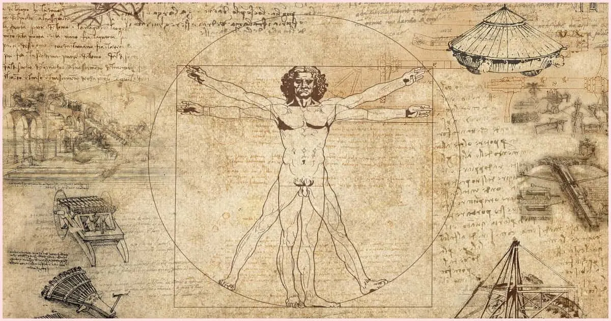
“The Vitruvian Man” by Leonardo da Vinci
I don’t think that there’s a more iconic symbol for proportions than “The Vitruvian Man” by da Vinci. The nude male form is shown in both a “T” formation and an “X” formation within a square and a circle. This shows how you can use geometric shapes to help dictate the proper proportions of the body as a whole.
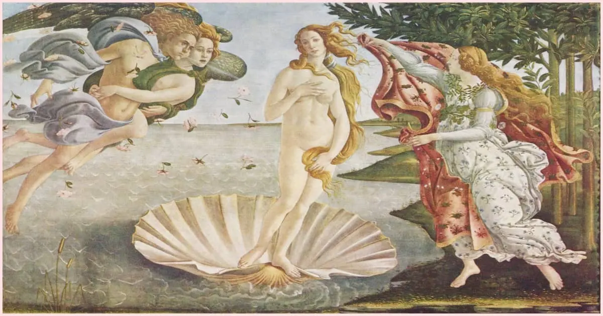
“The Birth Of Venus” by Sandro Botticelli
In this famous example, Botticelli used idealized and exaggerated proportions. From the gentle curve of her limbs to the muscles in her stomach, Botticelli painted Venus using what he believed (idealized) was the perfect proportions of the female figure during that particular time period. And, one look at the size of the shell Venus is emerging from is enough to tell you that its proportions have been exaggerated in comparison to everything else in the painting.
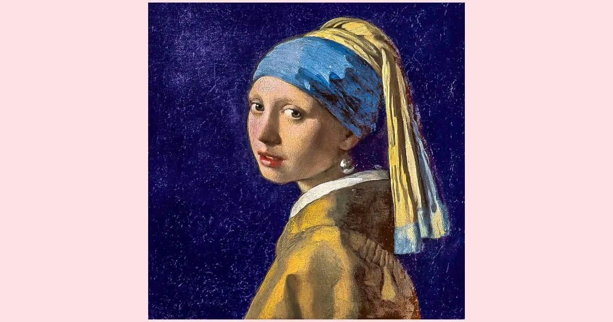
“The Girl with a Pearl Earring” by Johannes Vermeer
Vermeer used realistic proportions in his famous painting of a young girl wearing a headscarf and a pearl earring. The proportions of the facial features were done in a way that gives life, balance, and a sense of believability to the portrait. I mean, you can almost picture the young girl sitting patiently while Vermeer painted her likeness. Kudos to her! I don’t think I’d be able to sit still long enough for that!
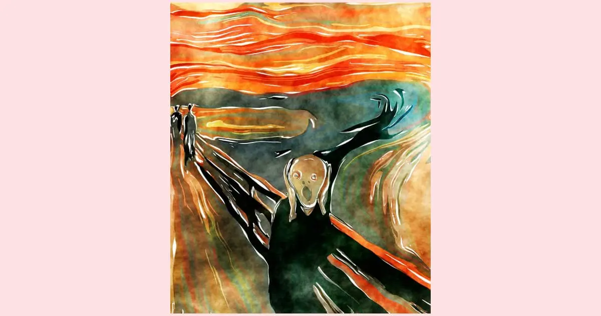
“The Scream” by Edvard Munch
This famous painting is a fantastic example of exaggerated and expressive proportions. Everything from the length of the face, the large mouth, and the size of the hands is elongated or widened to heighten the sense of fear, loss of control, and general turmoil Munch wanted to convey. It’s pretty darn genius when you think about it.
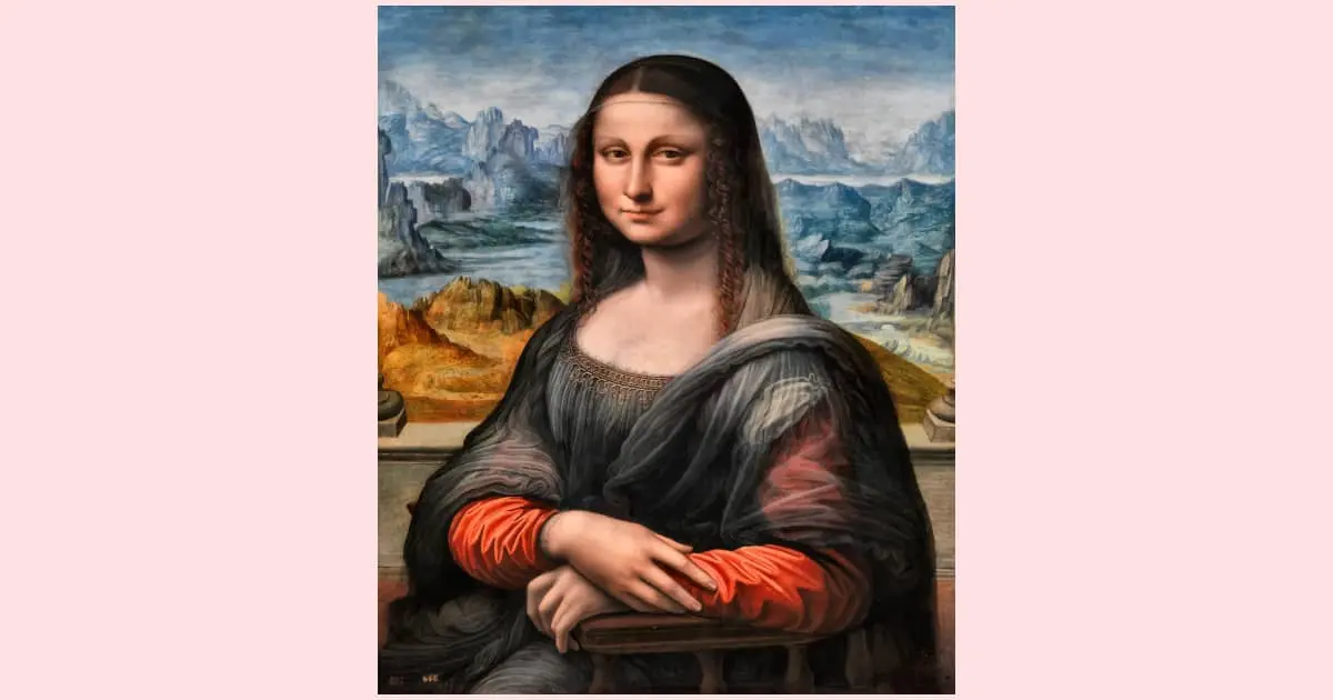
“Mona Lisa” by Leonardo da Vinci
I don’t think any list of famous paintings would be complete without mentioning the Mona Lisa (whether you’re talking about proportions in art or not). Da Vinci painted the Mona Lisa by adhering to the rules of realistic proportions. It was kinda his thing.
Final Thoughts On Using Proportions In Your Paintings
In a nutshell, proportion in art is like your artistic superpower, especially for beginners. It’s the secret ingredient that adds that extra oomph to your creations. Once you get it and how it works, you’ll feel like a magician wielding a wand (or in this case, a paintbrush).
Proportion is nothing more than observing, measuring, and comparing elements in your composition. Break things down into simple shapes, experiment with easy measurements, get all “da Vinci’s Code” with the Golden Ratio, or try all three.
Now, go forth, my painting pals, and conquer the realm of proportion! And, remember, in the end, it’s just paint! Don’t be afraid to play, make mistakes, and change your mind. You can always paint over it!